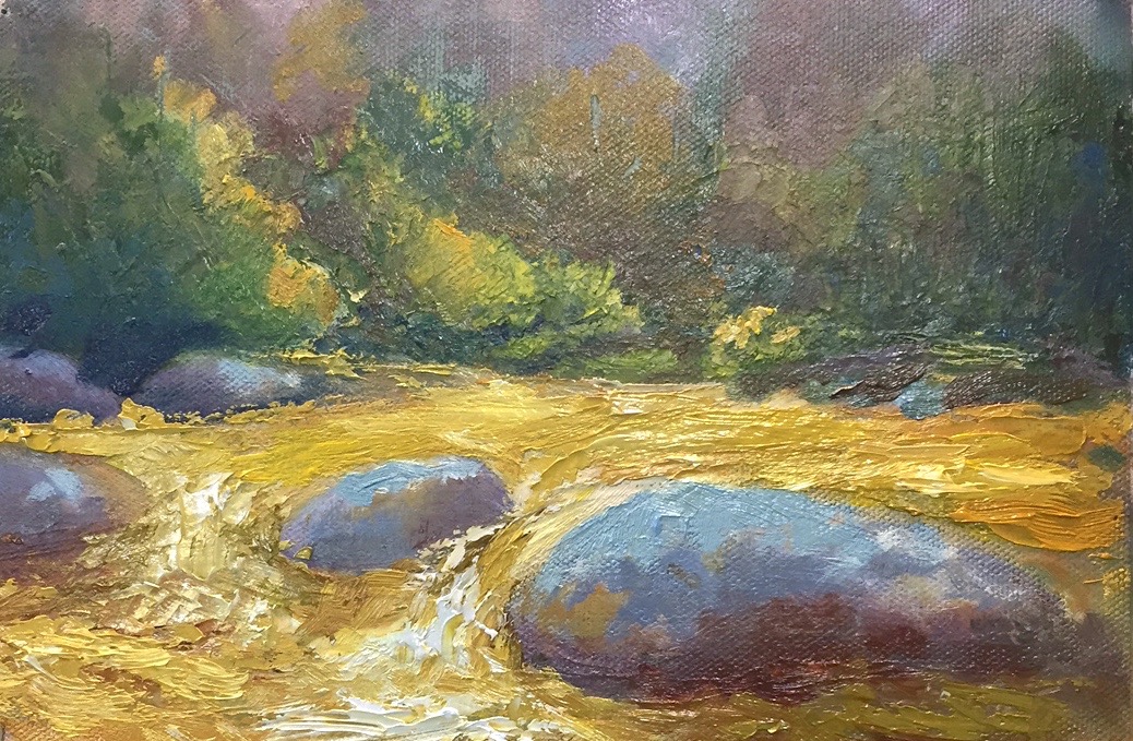
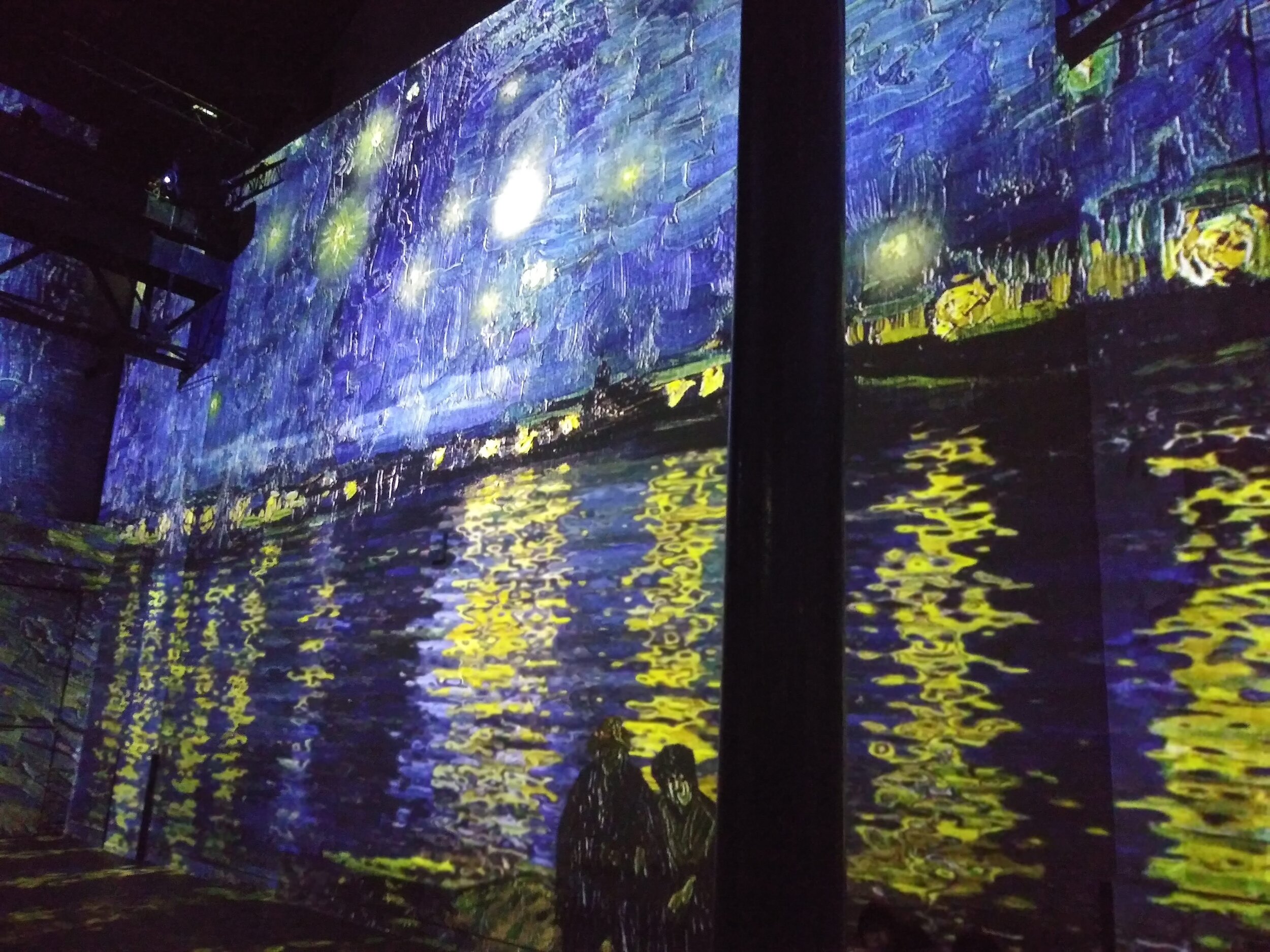
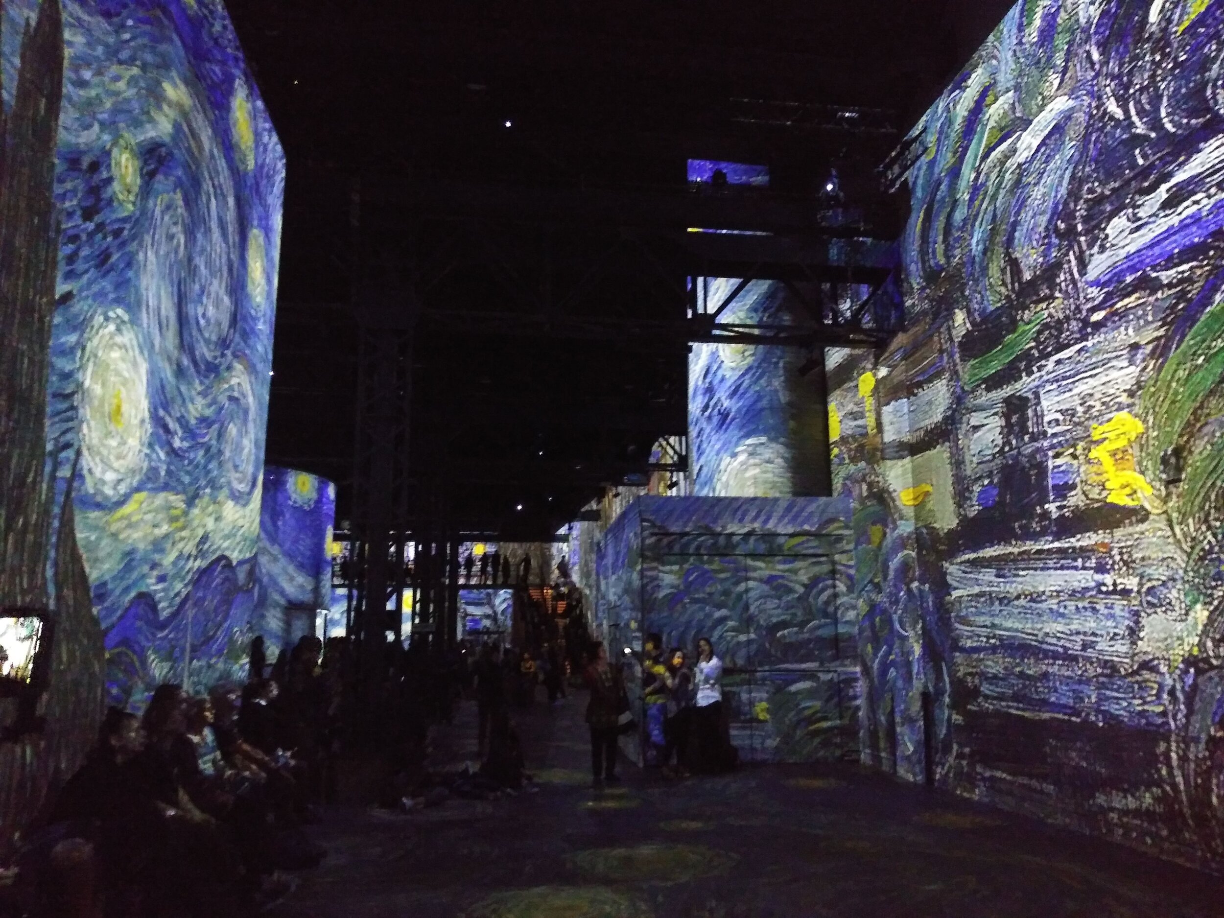
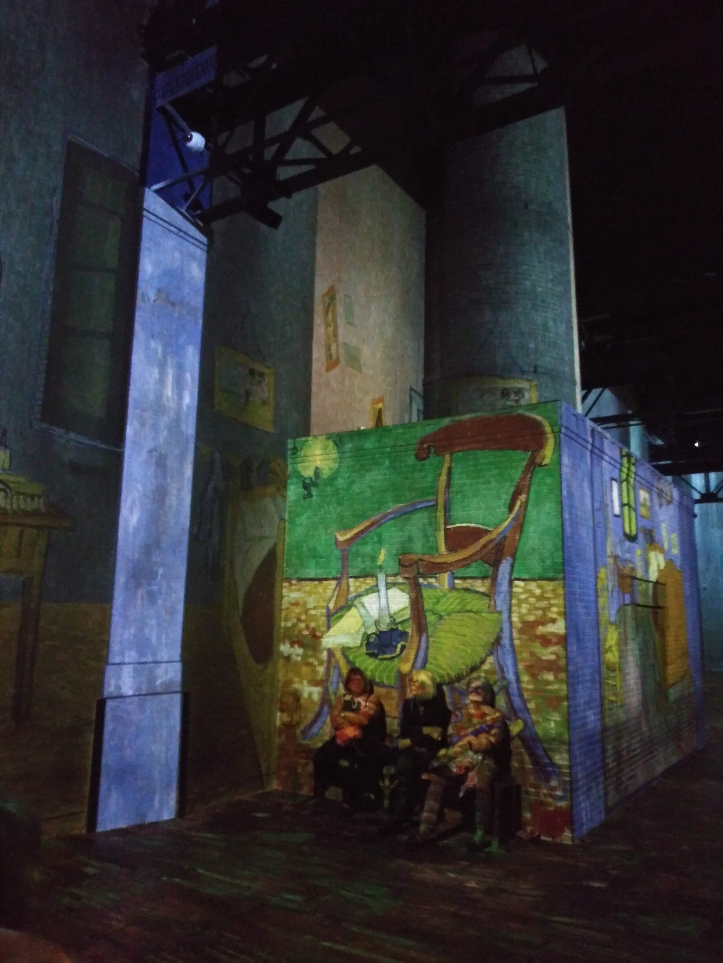
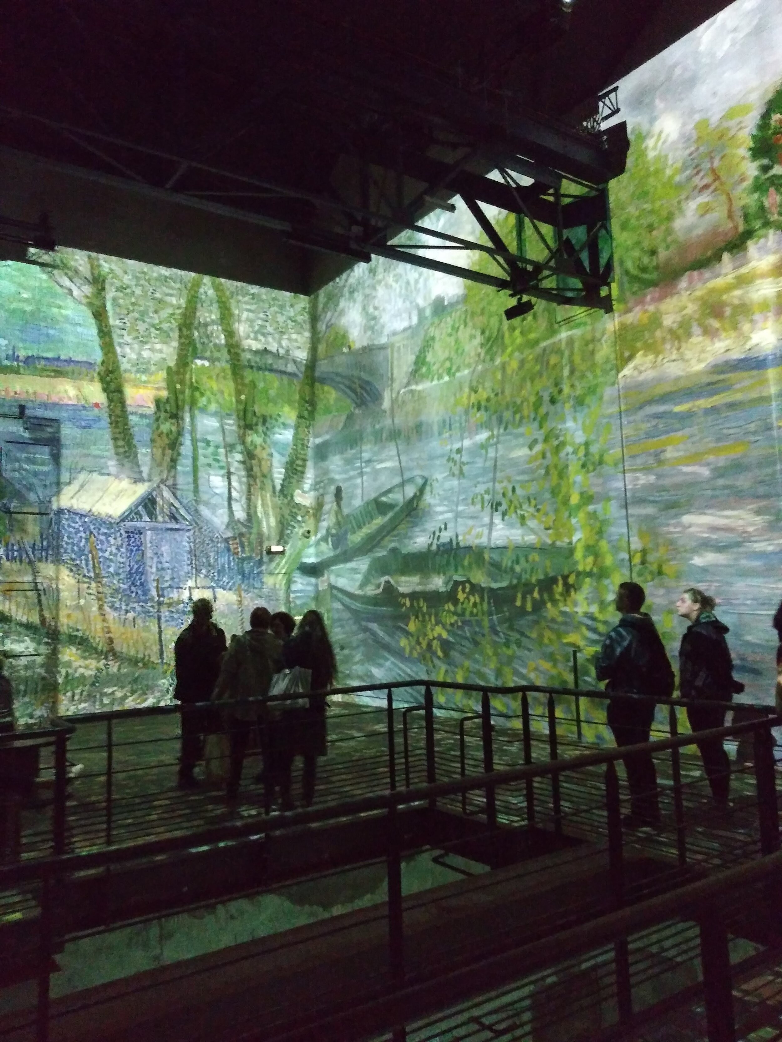
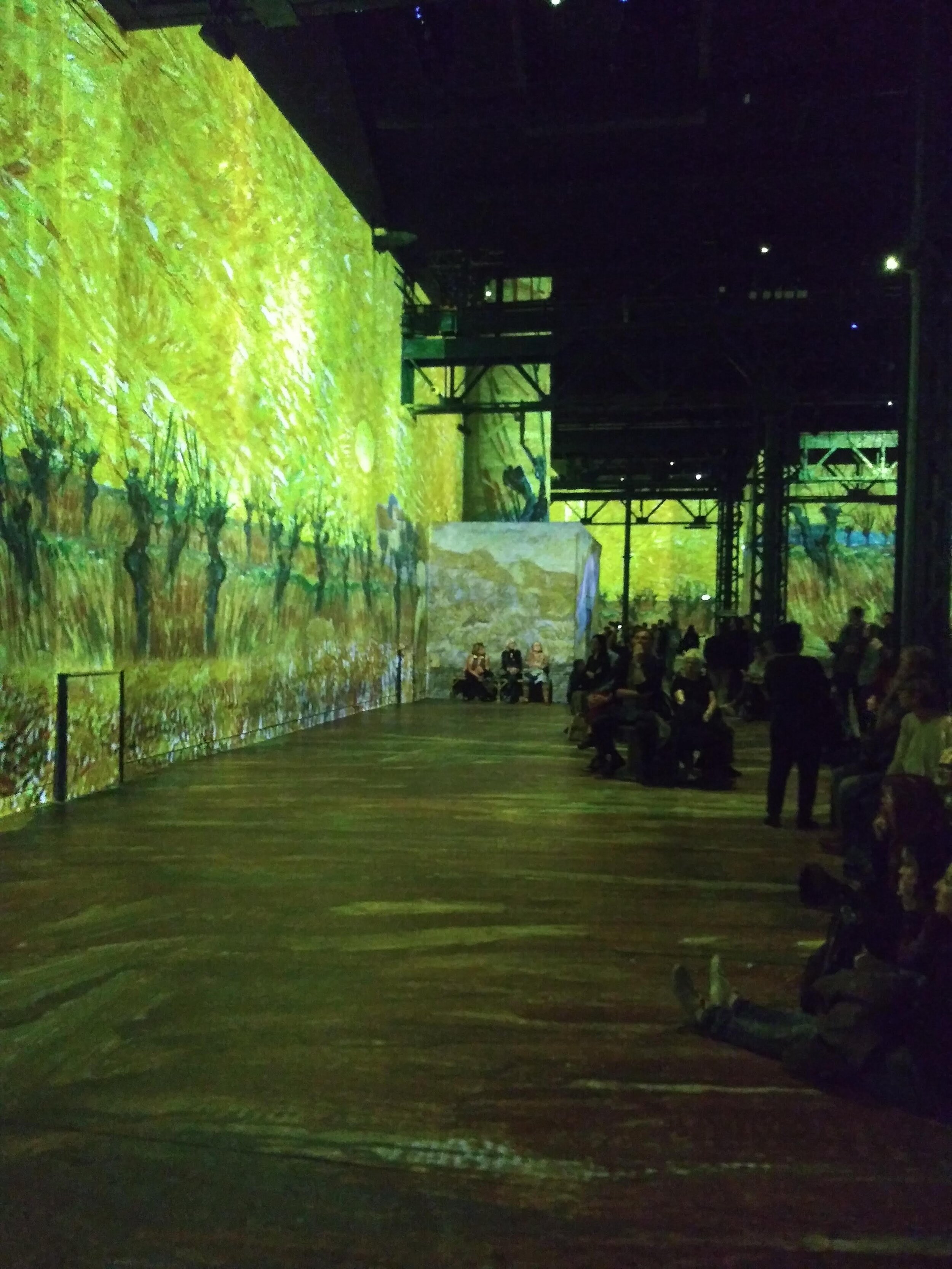
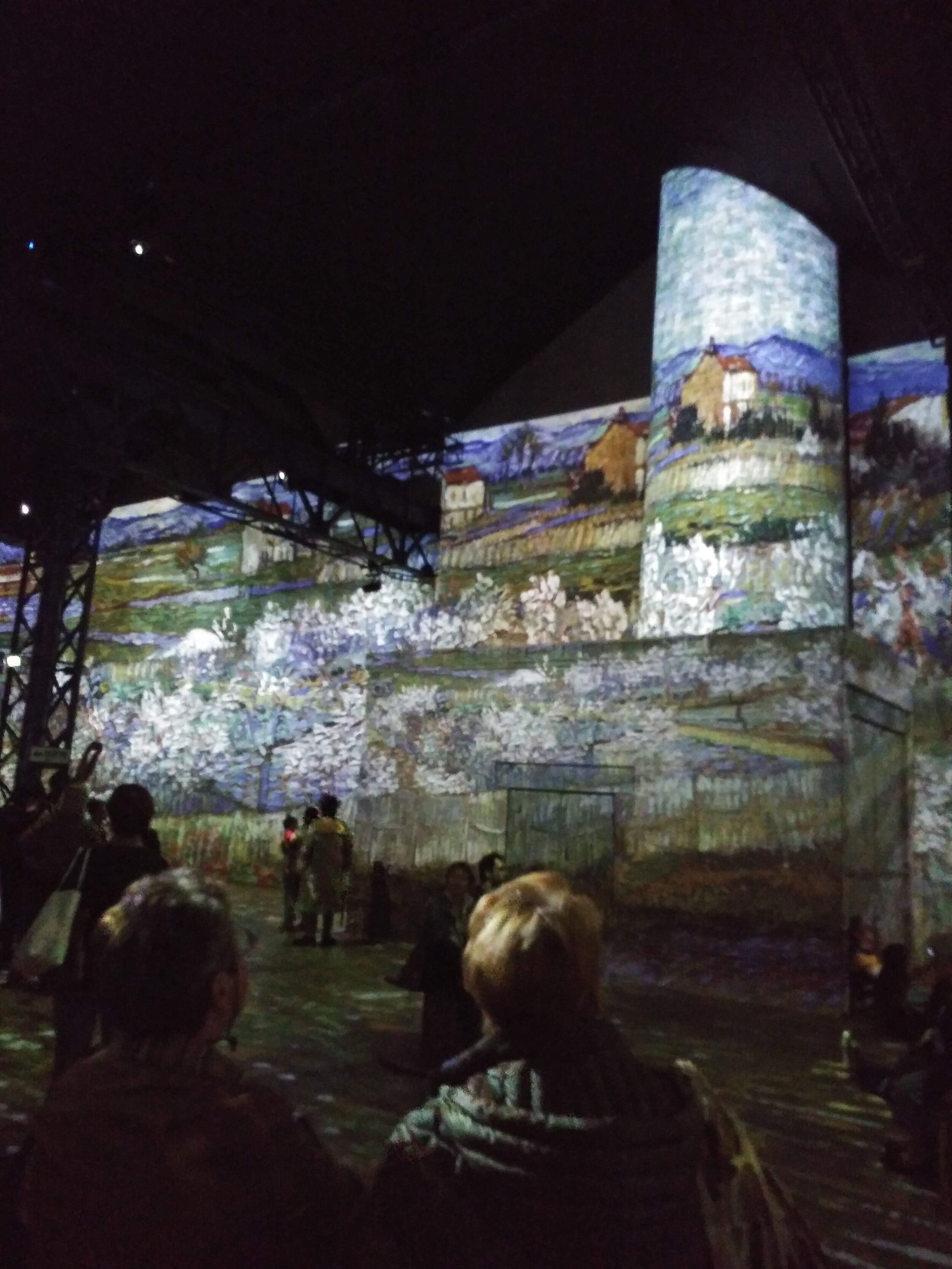
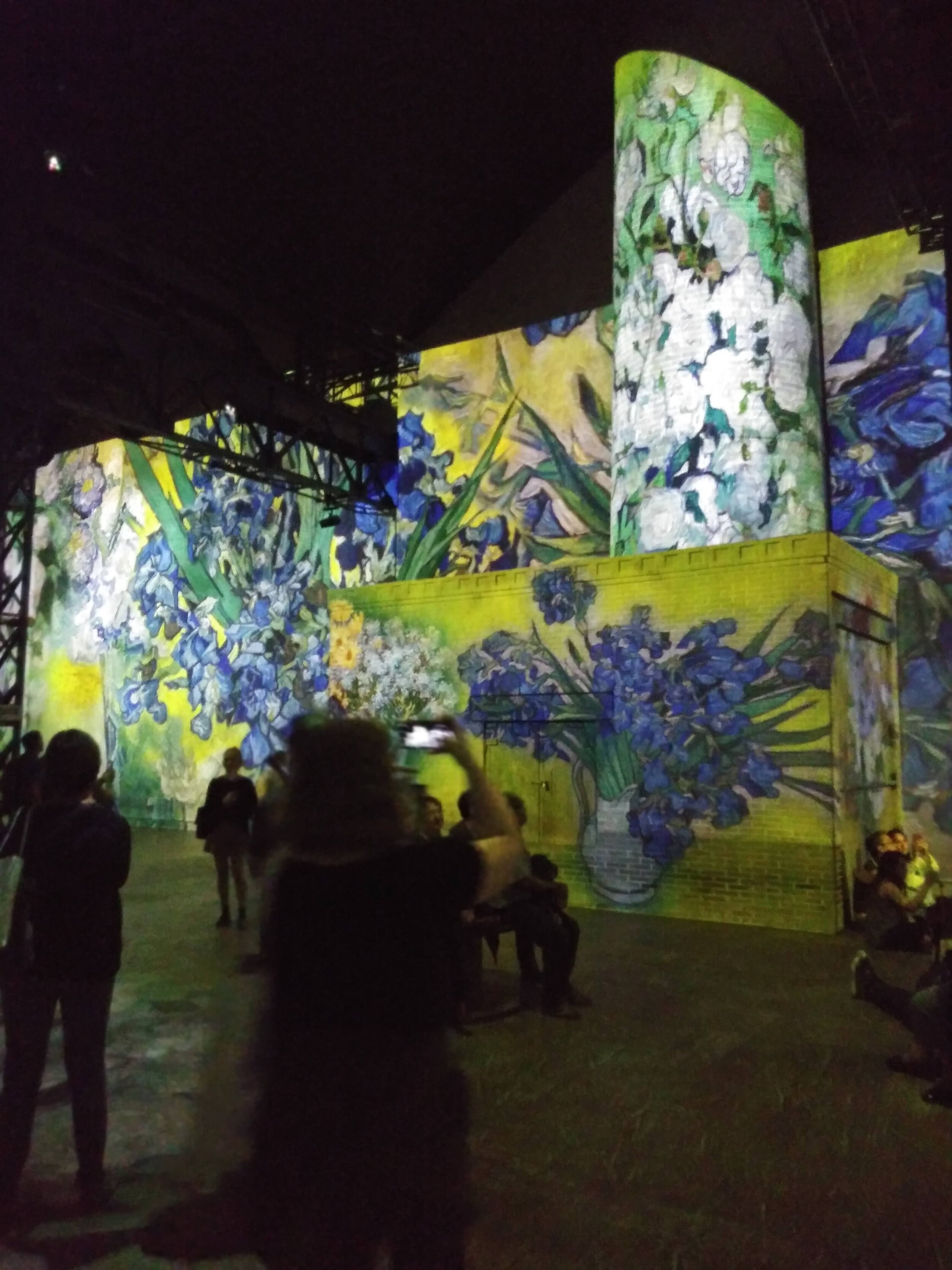
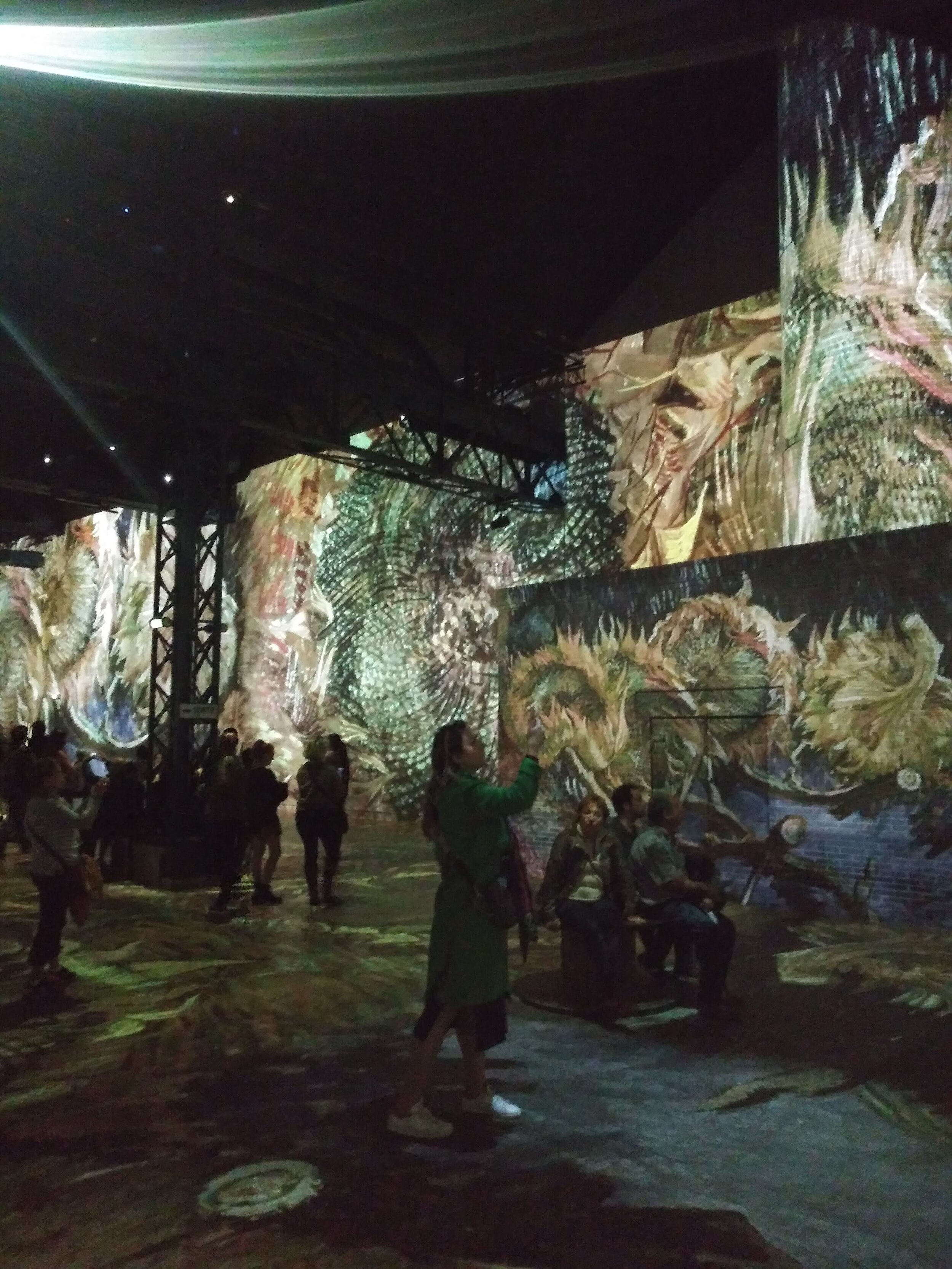
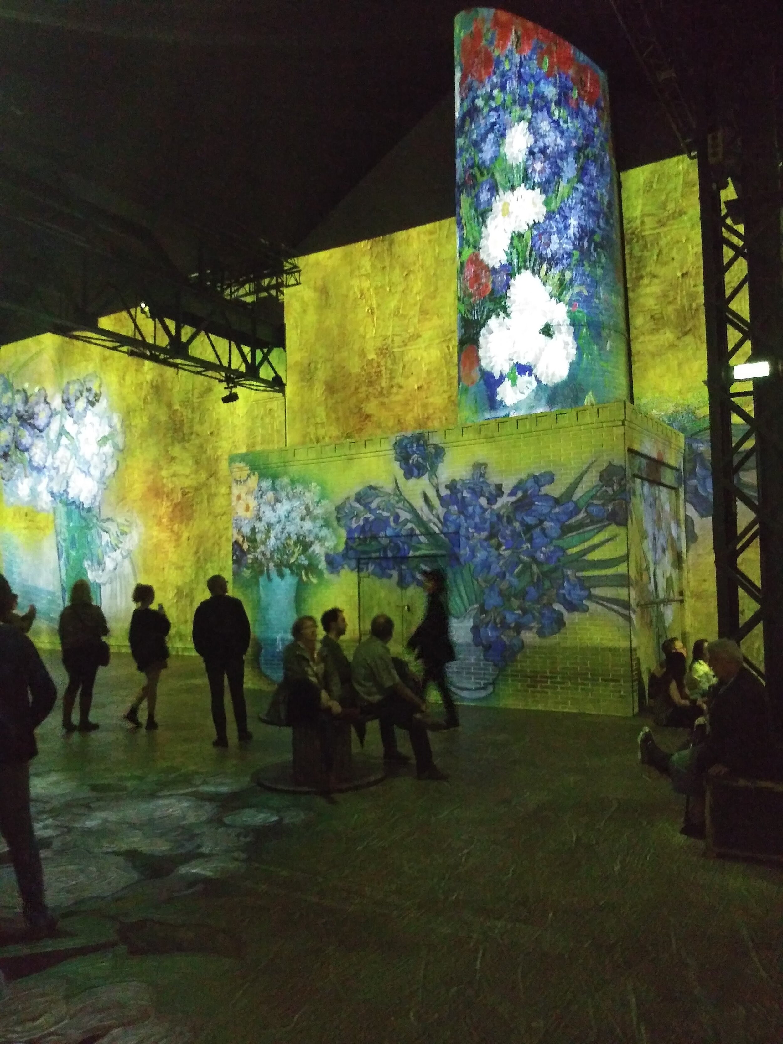
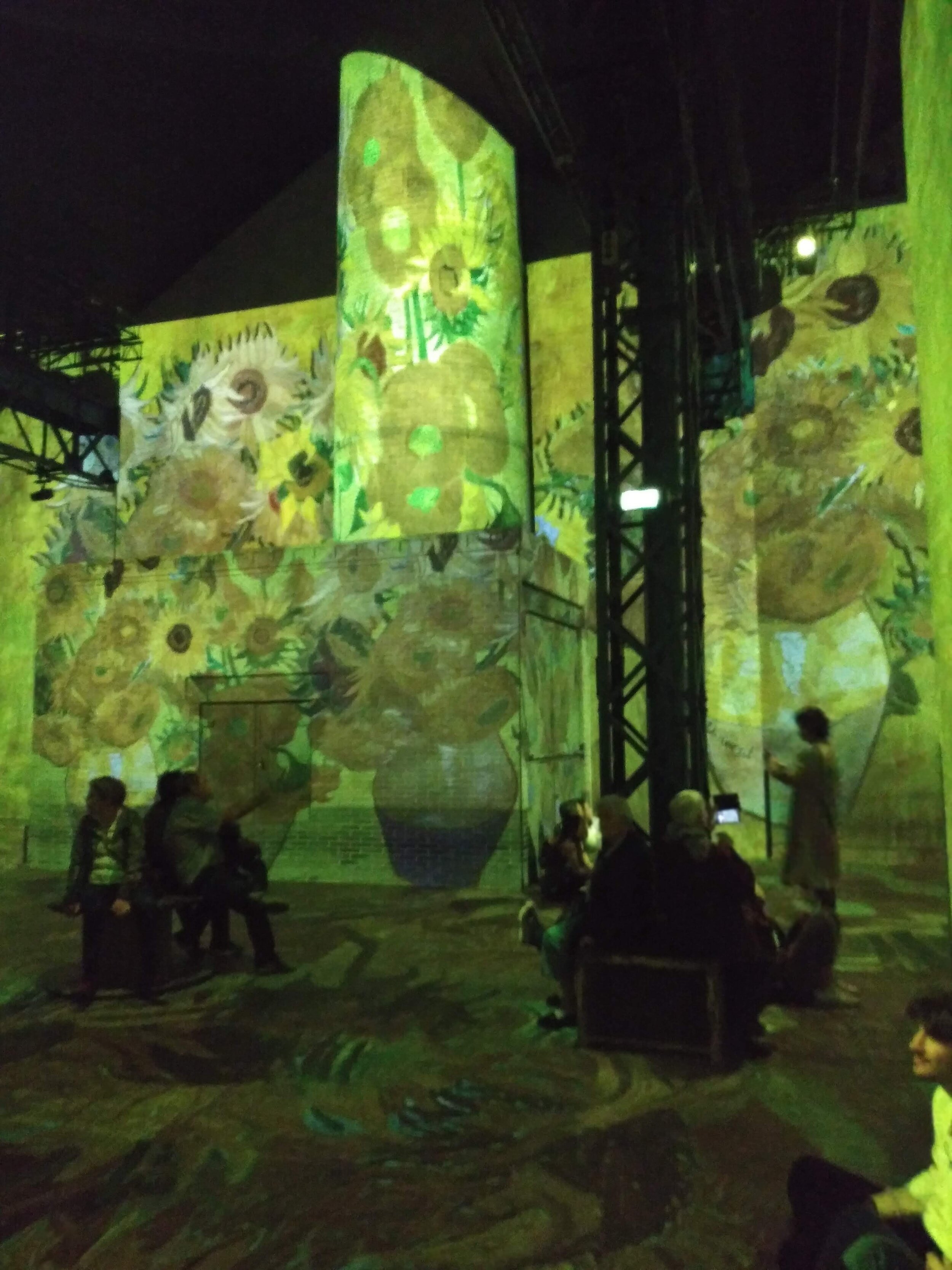
The Van Gogh exhibit at the Atelier Des Lumieres in Paris. Loved the experience!!
Check out the official website here. Great photos and videos of the exhibition. We loved it!!
Your Custom Text Here
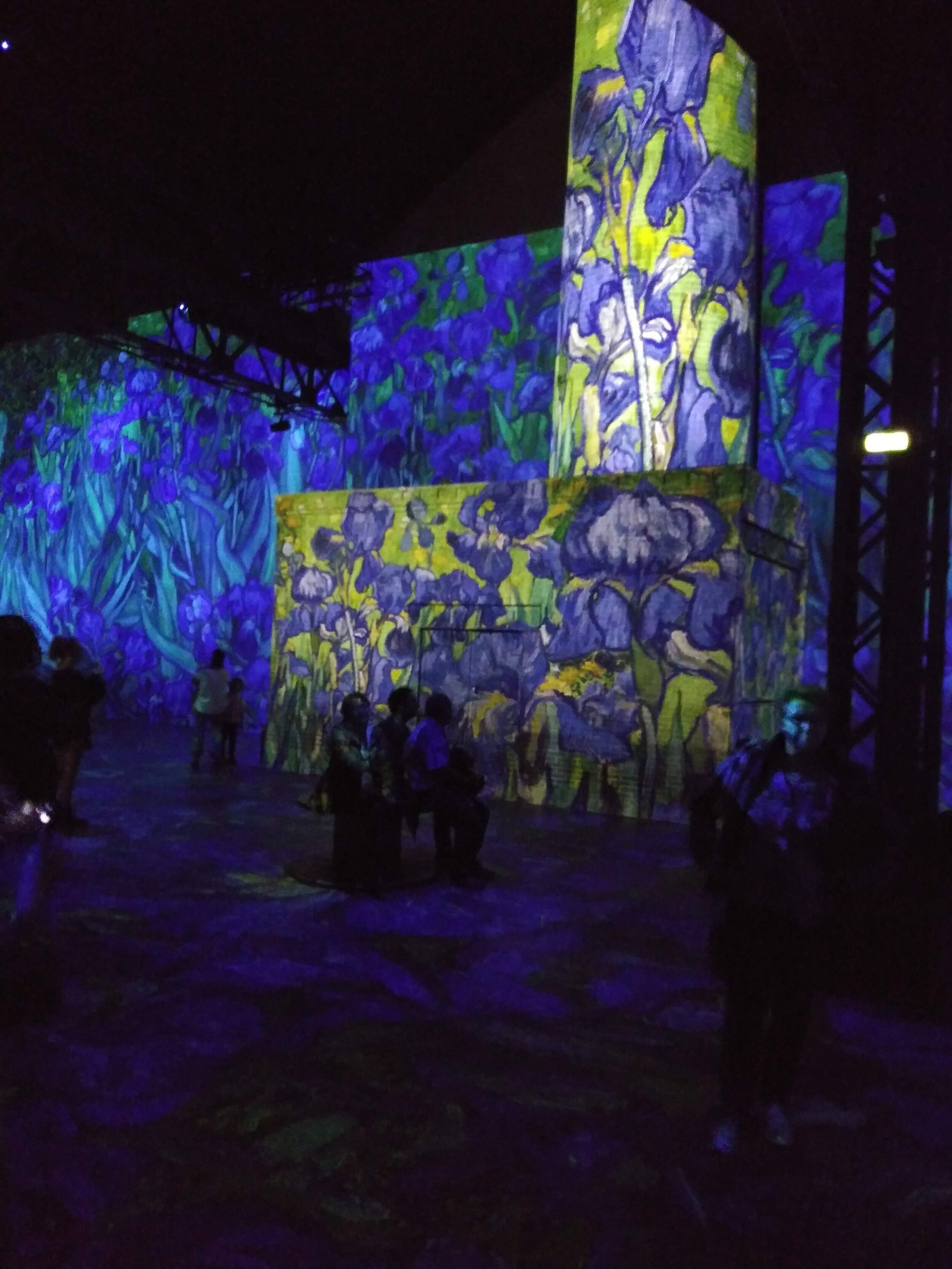
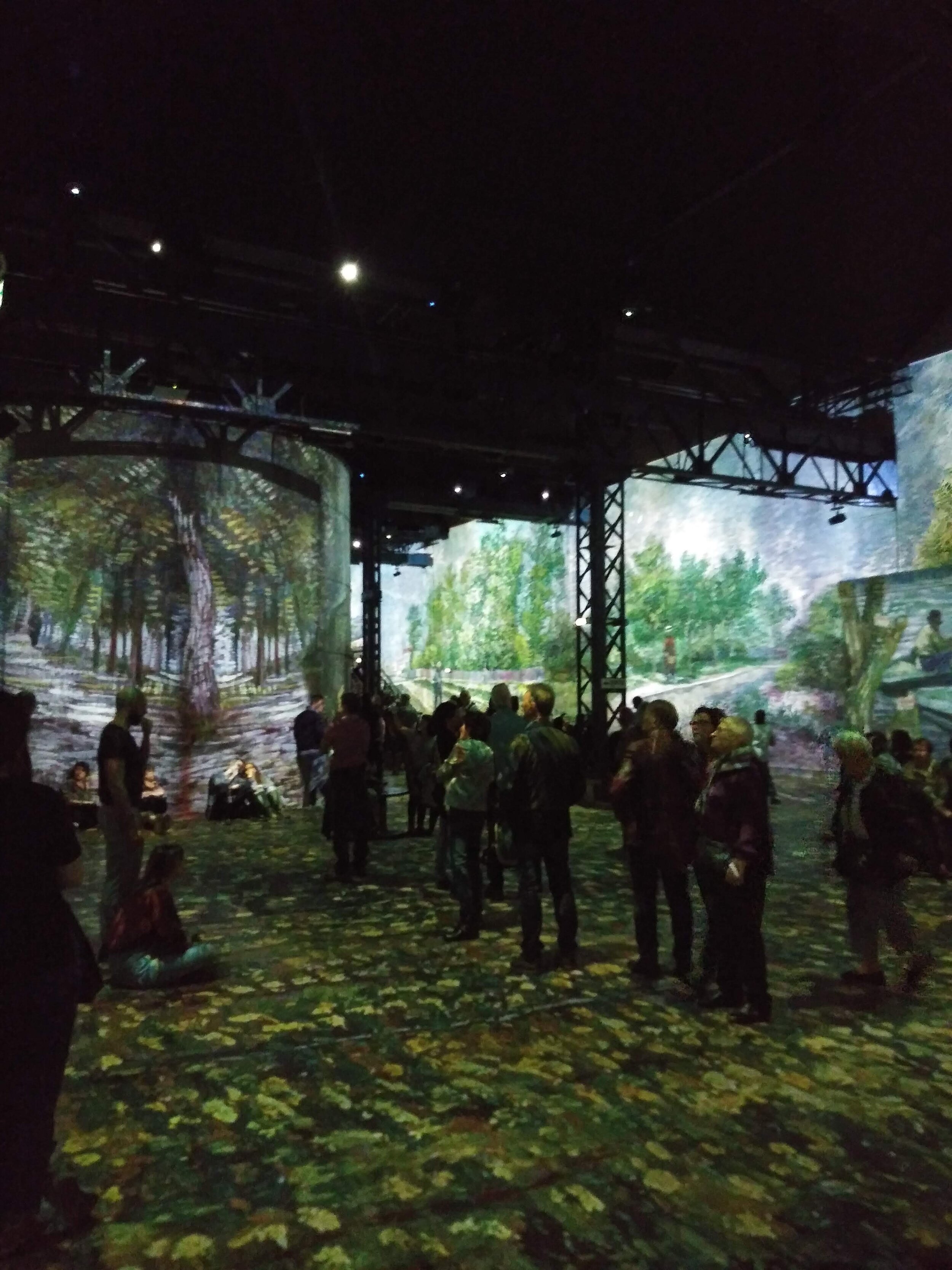
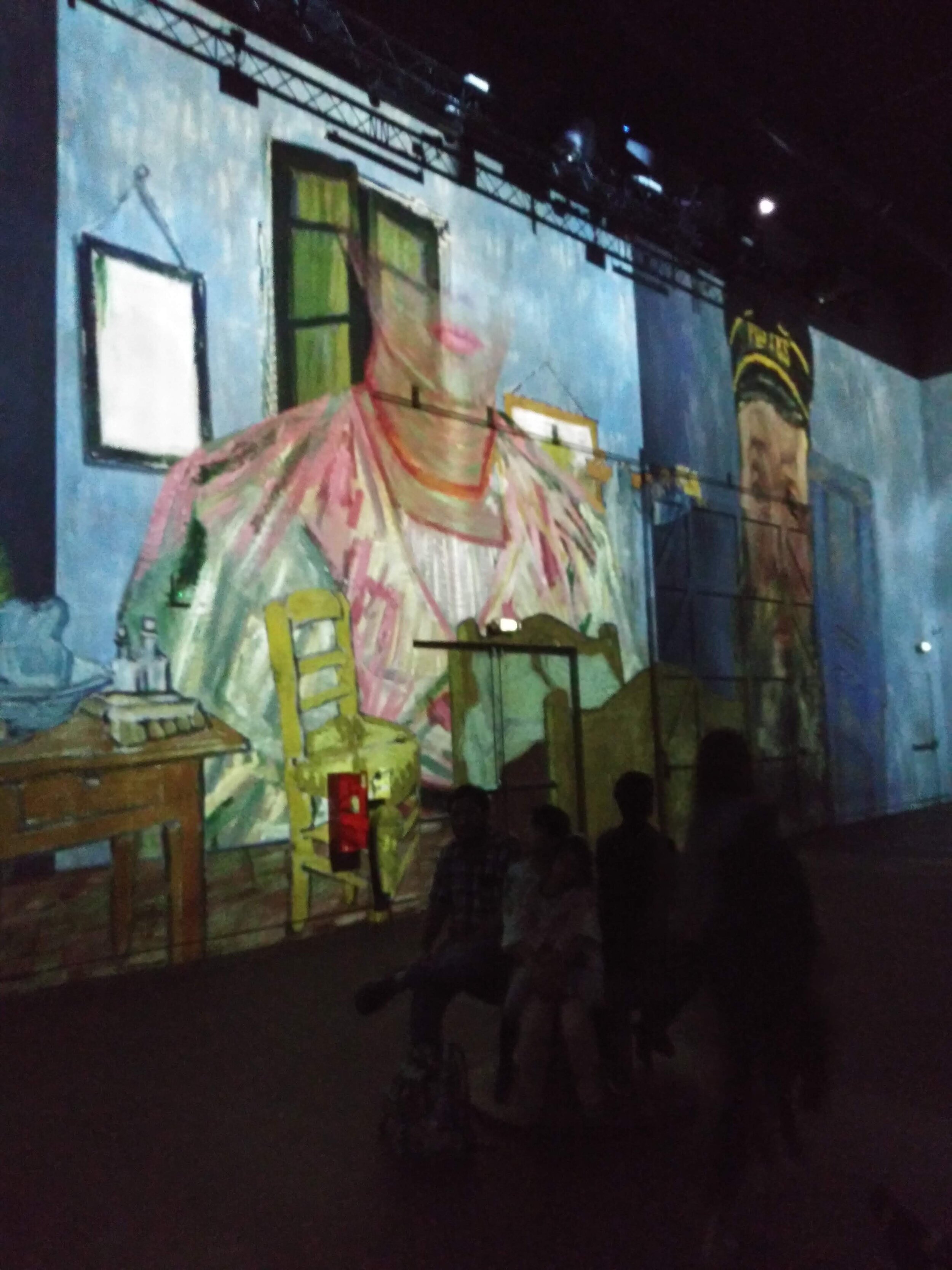
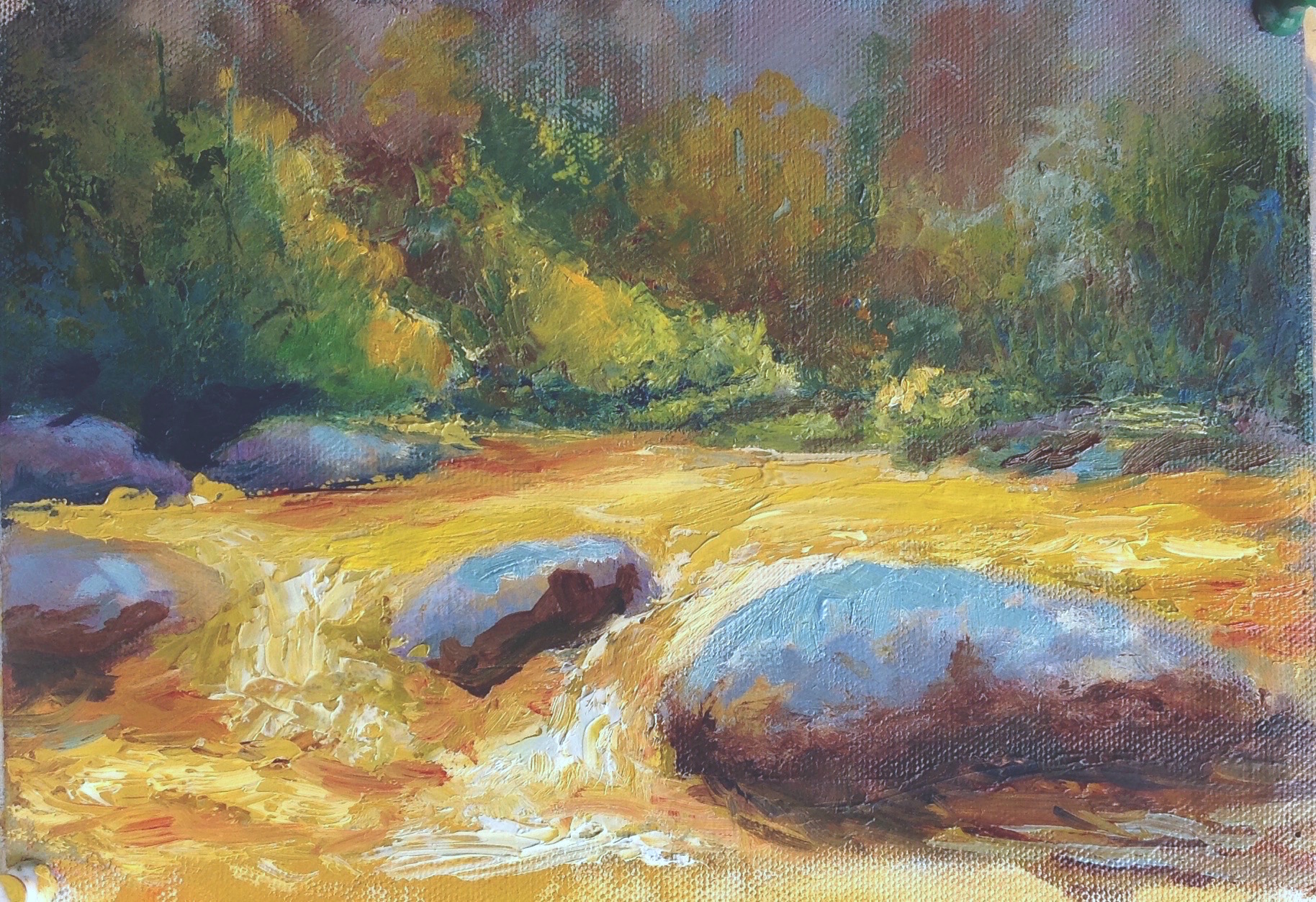
The Van Gogh exhibit at the Atelier Des Lumieres in Paris. Loved the experience!!
Check out the official website here. Great photos and videos of the exhibition. We loved it!!
Happy anniversary Rob
It's that time of year again. Join me in celebrating local artists this Sunday, June 9th for the 15th annual art show.


Weekly classes resume October 15 & 16
Check out all classes available online: Classes and Workshops,
Painting Studio Tues 6:00 PM - 9:00 PM and Wed 10 AM - 1 PM Private Lesson also available.
Classes held at DawnArt Studios 180 A 11th St NE, Atlanta GA 30309.
Questions? Get in touch dawn@dawnart.com
I Hope to see you soon,
Dawn

Arrive in Style
Happy New Year!!!!
Well, 2019 has arrived, and it’s time to start making plans for the New Year.
Have you been thinking about painting classes? I still have room in the Wednesday morning guided classes beginning Jan 9th, while the Tuesday evening classes, beginning Jan 8th, are wait list only. Each class series will begin again in early March. So, if you missed this series, make sure to sign up early for March. Private lessons are also available. Find more details here
Keep a look out for plein air events in the spring as well. I will be teaching a free class in Eatonton GA in early April, but I do plan to schedule a few more outings as well. More details to come and keep checking my website.
I wish you all a healthy and happy New Year!!


Here’s the finished tree. Happy Holidays!!!
I can’t believe It’s already this time of year. Wow, 2018 has flown by. Colony Square is celebrating the season with a Festival of trees. The reveal party is Nov 30th from 4 - 6. What is a festival of trees you ask? 30 uniquely painted holiday trees + barricade walls designed by local Atlanta artists displayed this holiday season (November 30th - December 28th). Plan your trip here during this holiday season to The Square and join us for the big reveal party.
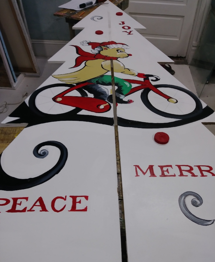
A sneak peak of my tree.
Fun for the entire family, explore the colony of trees and barricade walls, meet the artists who designed these beautiful works of art, enjoy live holiday tunes + entertainment, holiday s'more stations, kid-friendly and adult beverages provided by Sunshine Alchemy, and more surprises.
For questions email dawn@dawnart.com
Bring what you have but this is what you need for class.
I prefer working in oils because my mixture will stay wet for the class. Acrylic will dry quickly so you will need to keep them wet with water or a retarder.
Here is a list of suggested colors. But bring what you have. I like to have cool or neutral yellow, a warm blue, and a cool red and blue. Sap Green, Yellow Ochre, and Burnt Sienna are just great to mix with.
** See more about pigment codes below*
Pick a cool Red - Alizarin Crimson Pigment code PR83, or Permanent Rose Pigment code PV19 (primary).
Pick a cool or neutral Yellow - *Cadmium Yellow Light, PY 35 or PY3, or Hansa Yellow Light PY 74 ( I use Hansa Yellow Light from Utrecht ) * Most Cad yellows have the same code PY35. Make sure to open the tube and check to see it doesn't have an orange tint. Same name and pigment code Cad Yellow - but some are neutral and some have too much red. You can always add red, but you can’t take it out*
Pick a Cool Blue - My favorite is Phthalo Blue Green Shade PB 15 (primary), Cerulean Blue Chromium PB36. Prussia Blue, Manganese Blue – Just fine
Titanium white 5OZ Tube(Opaque wihte)
Yellow Ochre PY 42, or Yellow Oxide, either will be fine will be fine. (Great for Mixing)
Sap green or any warm green (mixture & great for mixing)
Optional colors to add later Naphthol Red or Cadmium Red or hue, Dioxide Purple - great for mixing
Beginning brush kit with a mix of bristle and soft brushes is an easy start. I have a photo below.
9 x 12, 12 x 12, 12 x 16 Canvases or panels or larger (panels work better for palette knife, but canvas is fine for all other classes) Bring extra panels or canvas pad for practice
Acrylic and oil disposable Palette Pad 16x20 . You can use a roll wax paper
Paint medium to help base coat your canvas and block in color. I use Gamblin Solvent Free Liquid or Gel. You can use other brands.
Solvent to clean burshes. I prefer Archival Odorless Solvent as it has no smell that I can tell. You can use Gamsol or turpinoid as well.
A sealed container for cleaning brushes. I use a Silicoil Jar. Or you can make your own. Click on the link for examples
Sketch pad
Pencil
Roll of paper towels
Palette knives plastic or metal- the plastic 5 pack at Binders is great for beginners ***If just buying one similar to the image below
For iPhone and iPad users, here my favorite app Accuview https://itunes.apple.com/us/app/accuview/id407578464?mt=8

Manufacturers are free to give their art supply colors whatever name they deem appropriate. Different manufacturers give different names to the same color, even if the same pigments are used. Therefore, names may vary from one brand to another.I tend to buy single pigments except for color that I mix all the time. If love a mixture that I don’t want to buy, often the codes on the back will tell me how to mix it myself. Also, I like working with a lot of transparent colors. You can always add a touch of white to make them opaque.
Alizarin Crimson PR: 83 (single pigment)

PR: 83 – The first letter Identifies whether a pigment or a dye is used. Here the P indicates that a pigment is used.
PR: 83 – The second letter identifies the pigment code. Here, the pigment code stands for red.
PR: 83 – The number indicates the specific pigment number.

Sap Green PG7, PY75, PBk9 (mixture of three pigments)
I hope this help you get started and get in touch with any questions

Join us on Thursday, May 10, 5:30-7:30 pm at the Solarium for the unveiling of the 2018 Decatur Arts Festival Poster. It’s free! The Solarium 321 West Hill Street, Decatur, GA 30030

Check out new paintings on in my gallery here
Spring is here and I'm ready for my first show of the year. I have a lot of new work to show and you can check it out on my gallery page. I finally added new paintings.
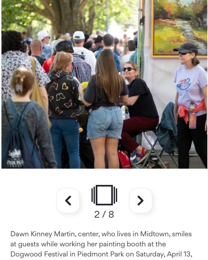
The Atlanta Dogwood Festival n Piedmont Park is just 2 weeks away. My booth is 110, If you enter the park at Piedmont Rd and 14th St, turn left and I'll be 10 booths down. Stop by and see my new work and say hello!
Dawn

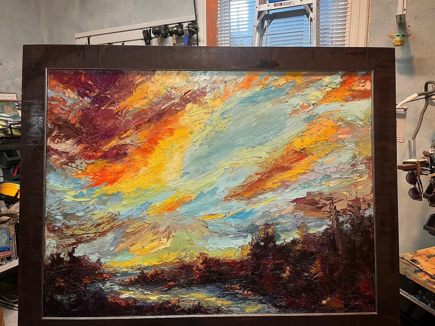
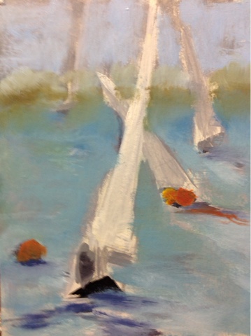
So happy to get back to my bicycle paintings. Arriving in Style 12" x 12 oil on canvas
Sketching out new bicycle paintings always makes me happy. I have a friend in The Hauge that allows me to paint from his awesome photos. You really should check out his work. It Kevin McPeake at Haagse Fiests Chic https://www.facebook.com/haagsefietschic/ It would be a cool adventure if we could arrange a show together.

Winter Weather Commute 12" x 12" oil on panel.
There are so many great bicycle painting I want to paint, I'm trying to be fast and furious and paint one in a day and at least one a week!. Go check out Kevin's site and see if you can pick out the photos I'm using for references..

Still time to sign up for classes! Fall is here is here and what a start of fall we've had! hope everyone faired the storms okay. I've had to push the start of classes back a week as there was no power in the studio last week.
Tuesday Evening Painting Studio
Tue, Sept 19 - Nov 21 6:15pm - 9:15pm 9 Weeks $255, 5 weeks $175.
Wed Guided Studio - All Levels
Wed, Sept 20 - Nov 22. No class Sept 27.10:00am - 1:00pm 9 Weeks $255, 5 weeks $175 ****3 spaces left.
Plein Air Retreat Coastal North Carolina **2 spaces left** Thurs, Oct 12 - 15. 3 nights lodging and some meals included. Check in Thurs. - check out Sun afternoon. $485
Interested in individual classes? Private Lessons now available 125.00 for 3 hours. Get in touch and I can design a class just for you.

Recent Award - First Place in the Perry Invitational Plein Air Quick Paint Competition.

If You find yourself in the Alexandria area this weekend, stop by the show. Details

Doors finally built and installed. Just about finished with this part of the project. Exciting!!
Here's what I have so far. I ran out of finished wood for the back splash, but it will be up soon. Very excited!!
Read more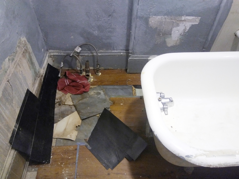
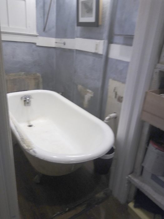
Studio bathroom remodel has started! Before the tub and toilet fell through the floor, we decided to pull everything out and replace the sub floor and update the space. You can see in the first photo, just how bad the floor is. Now I need someone to come over the help me get the tub out of there!!!

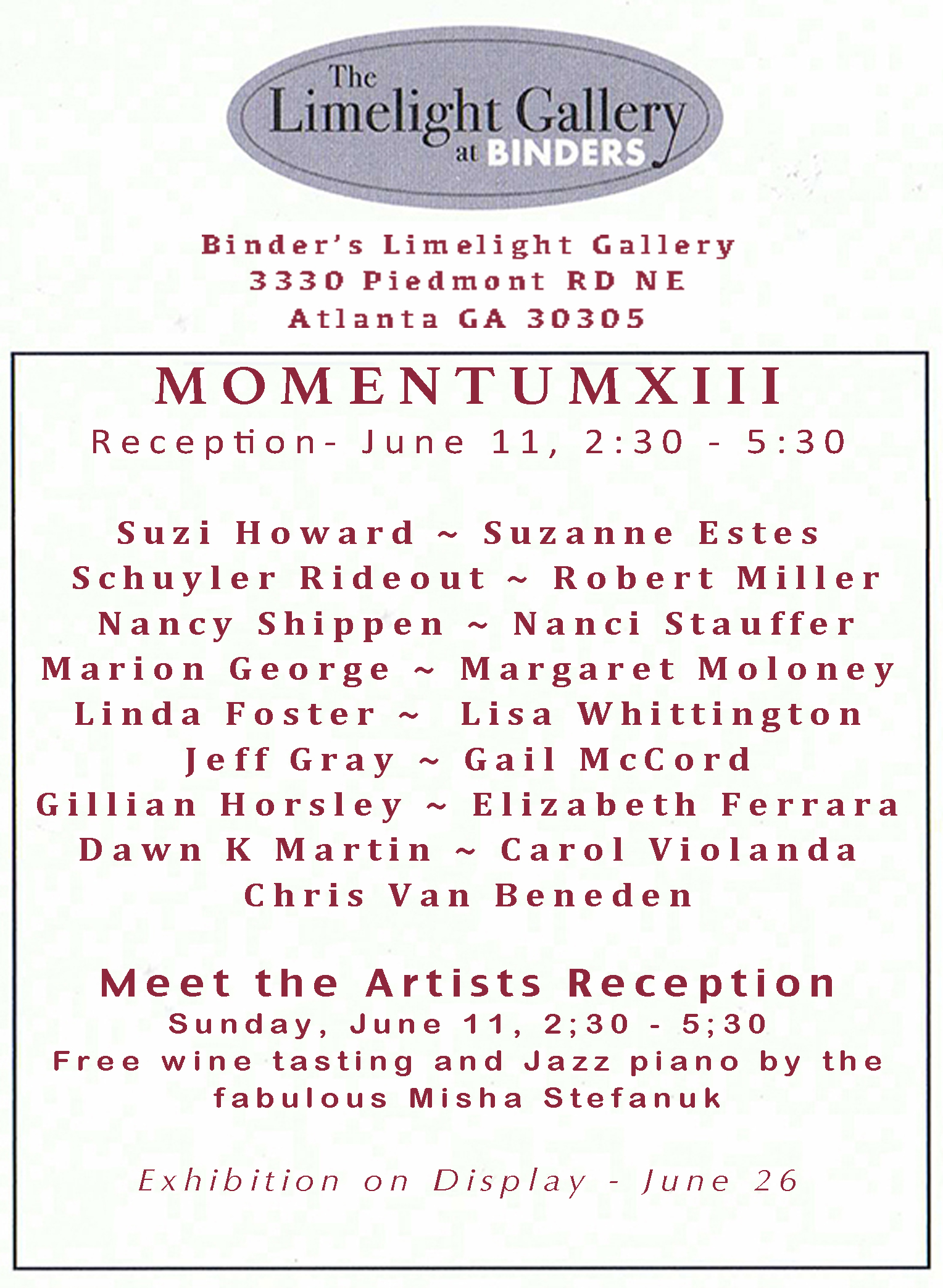
Celebrating Local Artists!! Join us June 11th, 2:30 - 5:30
The Tuesday Night Studio's 13th anniversary show at the Limelight Gallery in Binders Art Supplies. Don't miss a chance to meet all these wonderful artists and celebrate their accomplishments. We will have live music and a wine tasting as well.

Decatur Art Festival is this Weekend!!
I've been painting up a storm and have a lot of new work to show. It's May 27 - 28 Sat 10 - 6 and 11 - 5 on Sun. The Art show is on Ponce deLeon and you can find me in booth #70, In front of the old courthouse. More info here
Tuesday Evening Painting Studio
Tue, July 11 - Aug 6:15pm - 9:15pm 4 Weeks $140,
Painting Techniques for all levels
Wed, June 21 - Aug 2 10:00am - 1:00pm 6 Weeks $225.
Plein Air Retreat Coastal North Carolina **2 spaces left** Thurs, Oct 12 - 15. 3 nights lodging and some meals included. Check in Thurs. - check out Sun afternoon. $485
Paint Yelapa Mexico Feb 3 - 10 6 Person Max.
6 Day painting retreat. 5 night lodging, breakfast each day, one dinner party. Check out photos from my Jan 2017 trip here
Join me in celebrating local artists thisl June 11 2:30 - 3:30 at the Buckhead Binders Art Store and Gallery

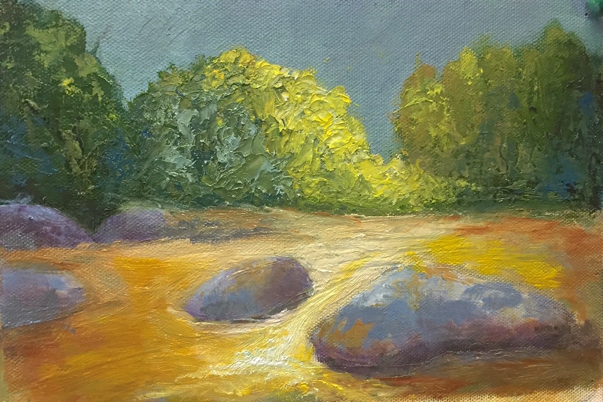
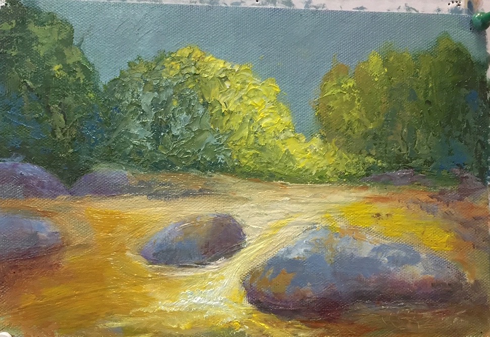
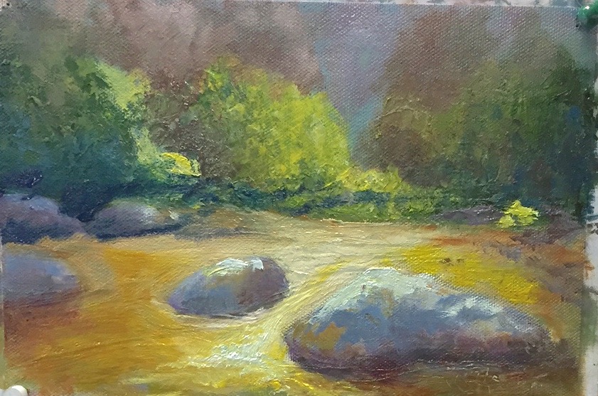
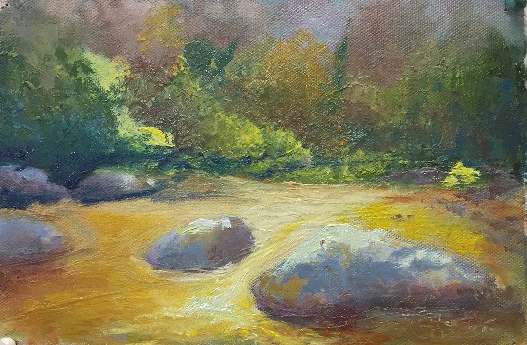
Here is a short slideshow of last weeks demo. One of my students brought a painting in and asked me to worked on it. We decided to take it a different direction. Taking out the sky and adding trees in the background. We talked about making area recede and changing the way the light moved through the painting. Need a few finally touches. I can talk about that this week. Take a look if you have a chance. Let me know if you have questions,
Dawn
Techniques class 1 Recap
By taking the time to work out your design and values before hitting the canvas can make the experience more enjoyable and result in a better painting. If you haven't decided where you are going with the painting or what are the most important elements, you can spend most of your painting time trying to work through all that and it will show.

Here is a recap of what we covered in class today. Working from a photo, create as many gesture sketches as needed until you are happy with the design. These need to be fast and are meant to help you work through your ideas about the composition. Make as many adjustments as you need. Next step, create a value painting using black, gray, and, white. By taking away the color in a study, it's much easier to see what is going on in the painting. Again, make any adjustments to make a stronger painting.
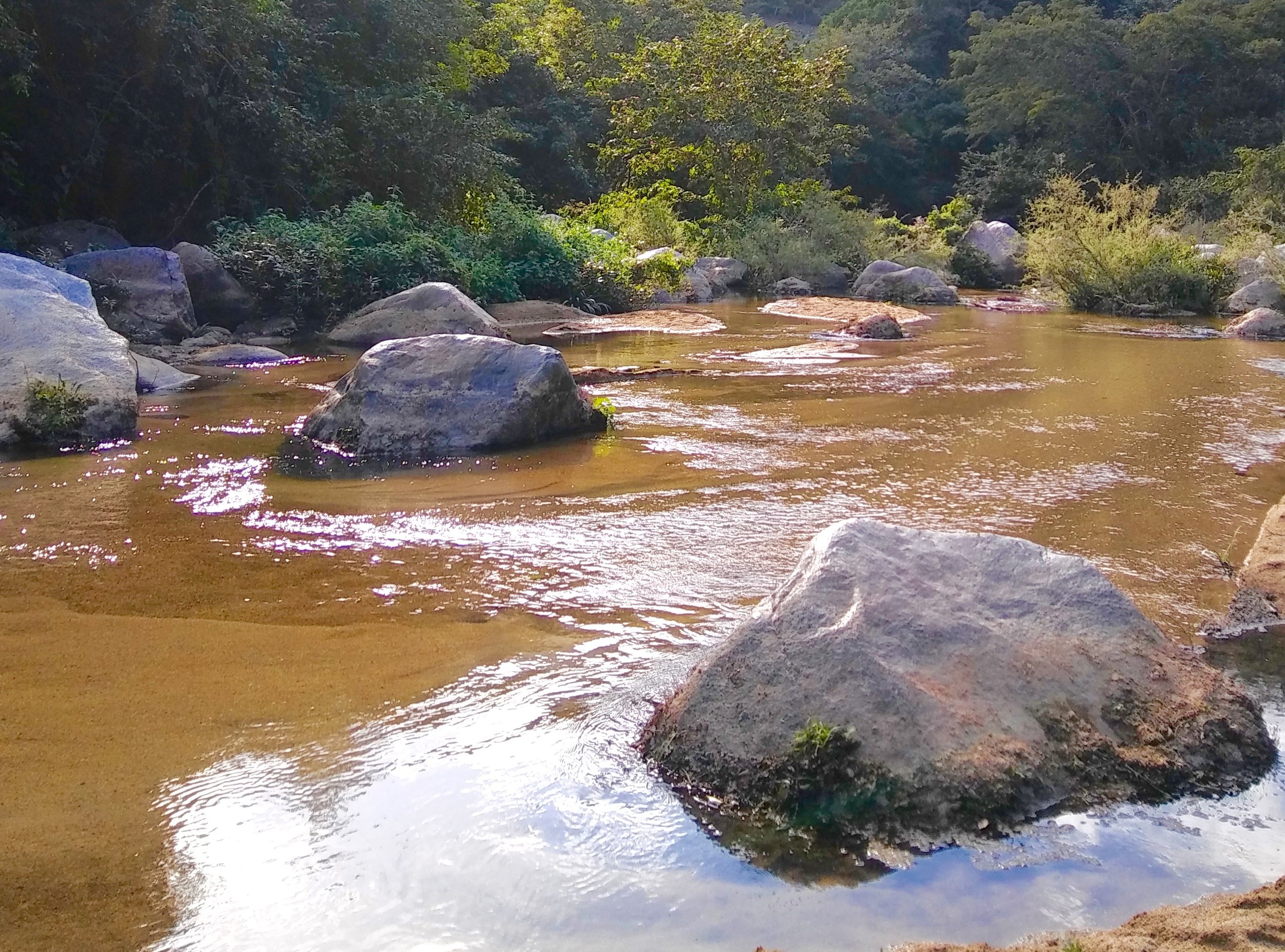
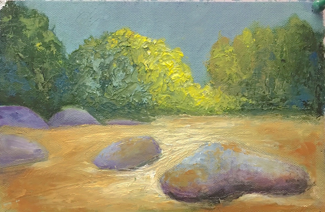
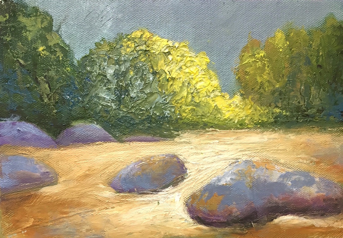
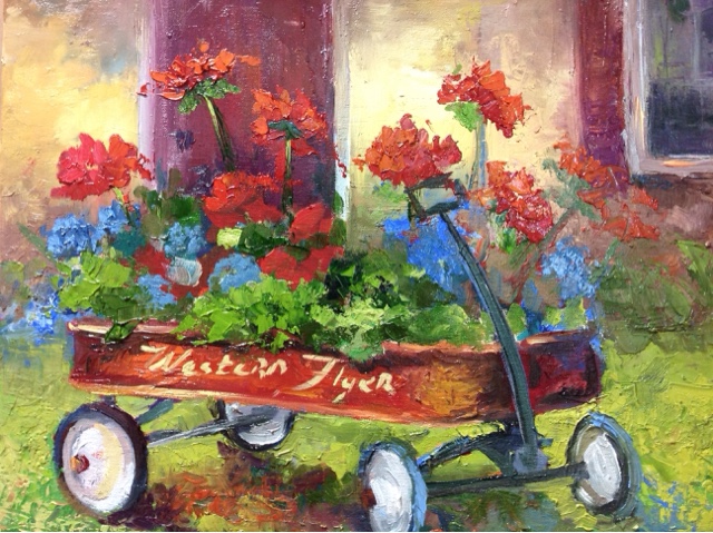
In this example, I am working from several different photos.
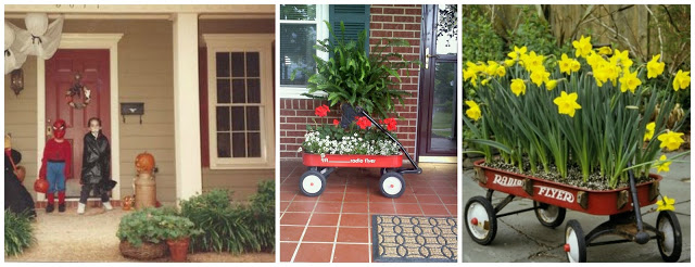
Below are my initial gesture sketches. The wagon is the focal point and the house is just the back drop. But in my first sketch the wagon is a minor player. I switched to oil pastel and tried agin. It wasn't until the 4th one, I came up with something I liked. I finally made the wagon the major part of the painting. I was able to work through this in about 30 mins. That's the beauty of a rough drawing, just keep tossing them out until you get a good one.

Gesture sketches for wagon painting
Next week - block in the painting with color.
I often will do this step in acrylic so that I can make quick adjustments before starting with the oils. When you"re happy with the overall design and color palette, it's time to paint!
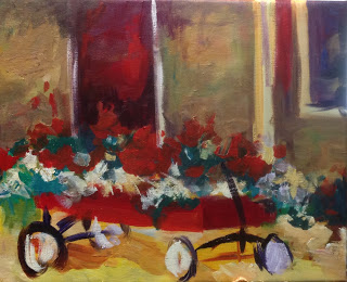
Blocking in color for wagon painting
All of this took under and hour, and the time and struggle it will save for the rest of the painting will be well worth it.
We will work on blocking in the color in next weeks class.
Second week making color notes.
Below you can see the next steps. Making color and value decisions.
Until then - have a great week!
Dawn
Hope to see you out there.
Happy fall, Dawn

New paintings ready for the show.
Spring is here and that means the Atlanta Dogwood Festival is right around the corner!
This is always my first show of the year and I can't wait. I've been painting up a storm and have a lot of new work to show. It's April 7 - 9 in Piedmont Park and you can find me in booth #111. More info here
Tuesday Evening Painting Studio
Tue, April 4 - June 6 6:15pm - 9:15pm 10 Weeks $295, 5 weeks $175.
Painting Techniques for all levels *** 1 space left
Wed, April 19 - May 24 10:00am - 1:00pm 6 Weeks $225.
Plein Air Retreat At Parker Ranch
3 Day Workshop Fri. May 5, 1:00pm through Sun. May 7, 3:00pm
Plein Air Retreat Coastal North Carolina **2 spaces left** Thurs, Oct 12 - 15. 3 nights lodging and some meals included. Check in Thurs. - check out Sun afternoon. $485
Paint Yelapa Mexico Feb 3 - 10 6 Person Max.
6 Day painting retreat. 5 night lodging, breakfast each day, one dinner party. Check out photos from my Jan 2017 trip here
I hope to see you in a class soon. Please get in touch if you have something you'd like to see me teach.
For more info, check out my Classes page.
Hooray for spring!
Dawn
I know I've always said I'd never make videos, but after giving a talk at the Eatonton Art Guild, there were a lot of questions on how to use the hardware I recommended. I just happened to be in the studio framing that day, so a no frills video seemed like the easiest way to explain myself!
Hope you find this helpful,
Dawn
PS this is where I order my spring clamp American Frame
http://www.americanframe.com/products/wood-picture-frame-spring-clip-f9100.aspx