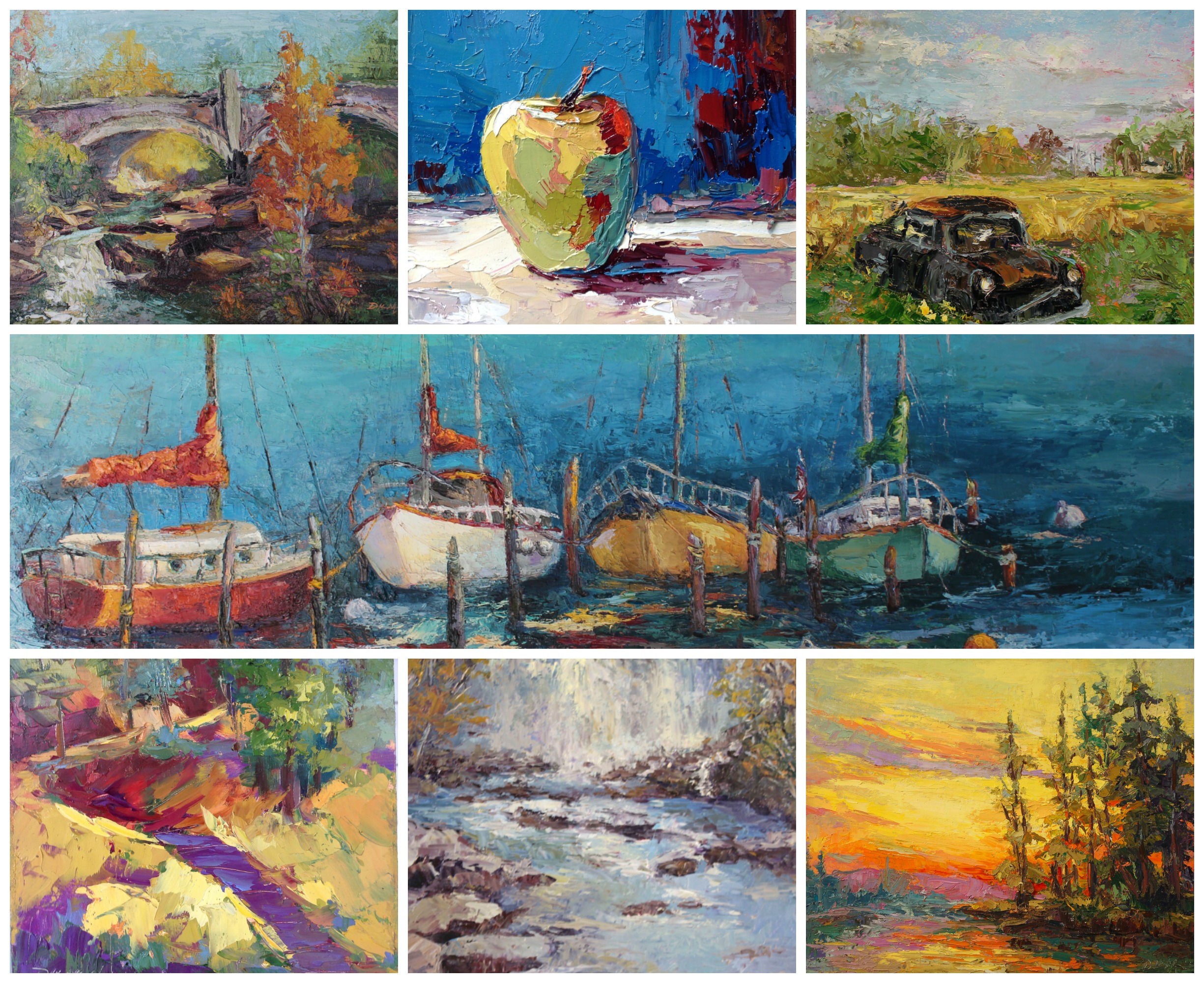
I have room for one more in the Wed morning class and 1 for the 5 week session on Tuesday nights. Join me if you can. Classes start this week!
Your Custom Text Here
I have room for one more in the Wed morning class and 1 for the 5 week session on Tuesday nights. Join me if you can. Classes start this week!
I love painting scenes of cyclists. I guess it makes me feel the joy of being out on two wheels while working in the studio! Here I'm using a photo by my friend and great photographer Kevin McPeake for my inspiration. You can check out his work on Facbook
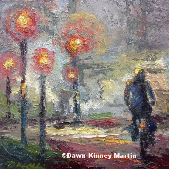
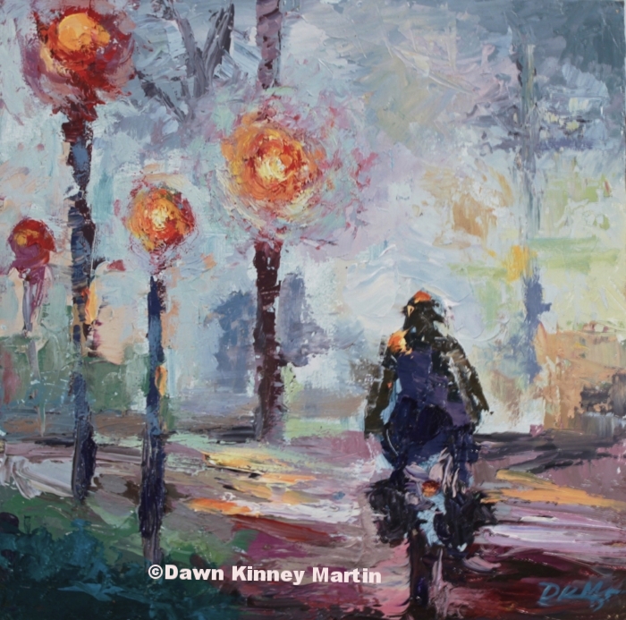
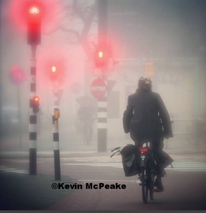
I loved this photo when I saw it: love the diffused light and the mystery in the fog. I painted this image about a year ago ( middle image ), but decided to give it another try and work on the grays a little differently. Here's the second attempt ( the image on the right). I was a little bolder with the reds. Although it similar to the first painting, this one feel more like night time to me.

Happy New Year!!!!
I hope everyone had a little fun and adventure over the holiday.
I know I'm a little late getting the class schedules out, but here it is. I'll add a few more 1 Day workshops soon, but wanted to get the weekly class schedules out before it was too late!
Tuesday Evening Painting Studio
Tue, Jan 10 - March 21 ( No Class Jan 24 ) 6:15pm - 9:15pm 10 Weeks $295, 5 weeks $175. Next series begins April 4
Painting Techniques for all levels
Wed, Jan 11- Feb 25 ( No Class Jan 25 ) 10:00am - 1:00pm 6 Weeks $225. Next series beginsMarch 16
Plein Air Retreat At Parker Ranch
3 Day Workshop Fri. May 5, 1:00pm through Sun. May 7, 3:00pm
3 1/2 Day Plein Air Retreat Coastal North Carolina
More info soon
3 Day weekend in October- still working on the dates.
3 nights lodging and some meals included. Check in Thurs. - check out Sun afternoon. $485
I hope to see you in a class soon. Please get in touch if you have something in mind you 'd like to see me teach a class on
For more info, check out my Classes page.
Join me if you can. I'd love to paint with you!
Dawn

Weekend Getaway 24" X 36" oil on canvas
The frame just came in and I'll be able to deliver this commission tomorrow - Yay!!! We were down to the last minutes, but I'm so happy I'll be able to deliver before Christmas.
I've been working closely with the family on this projects, but it just took time to get all the decisions ironed out. It's always worth taking it slow to make sure it's a painting they love and I'm glad we didn't rush.
Now I look forward to taking a few days to spend with family.
Happy Holidays!
Dawn

Tallulah River 24 x 36 oil on canvas
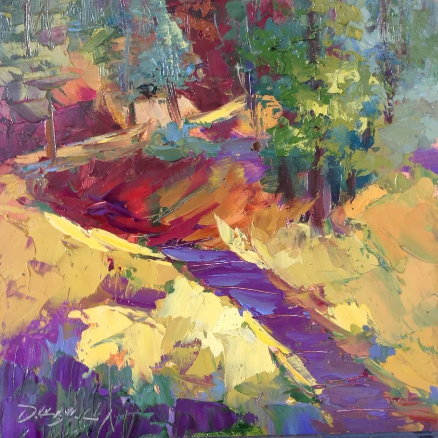
This is a good time of the year to tackle those unfinished paintings laying around the studio. Time to give them a little love. Here's one I've almost finished. Yay, time to get to work on another one!

Phase 1 - Out with the old sink cabs and in with the new! Over the holiday break I decided to finally redo our kitchen. We've had a plethora of plumbing problems and just couldn't put it off any longer. ( The water was coming out the back wall!) I decided to build the cabinets using palette wood. I like the character of reclaimed wood and at free, the price is right!!
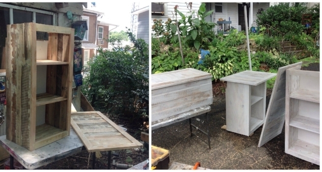
Now to build the wall cabinets! They are a basic box with a facing and shelves. Once built. I filled the cracks and gaps with a wood putty, then sanded everything with a belt sander. Since I'm using various types of wood, I put on a white wash to even out the variations of color. When that dried, I coated them with a stain and several coats of polyurethane
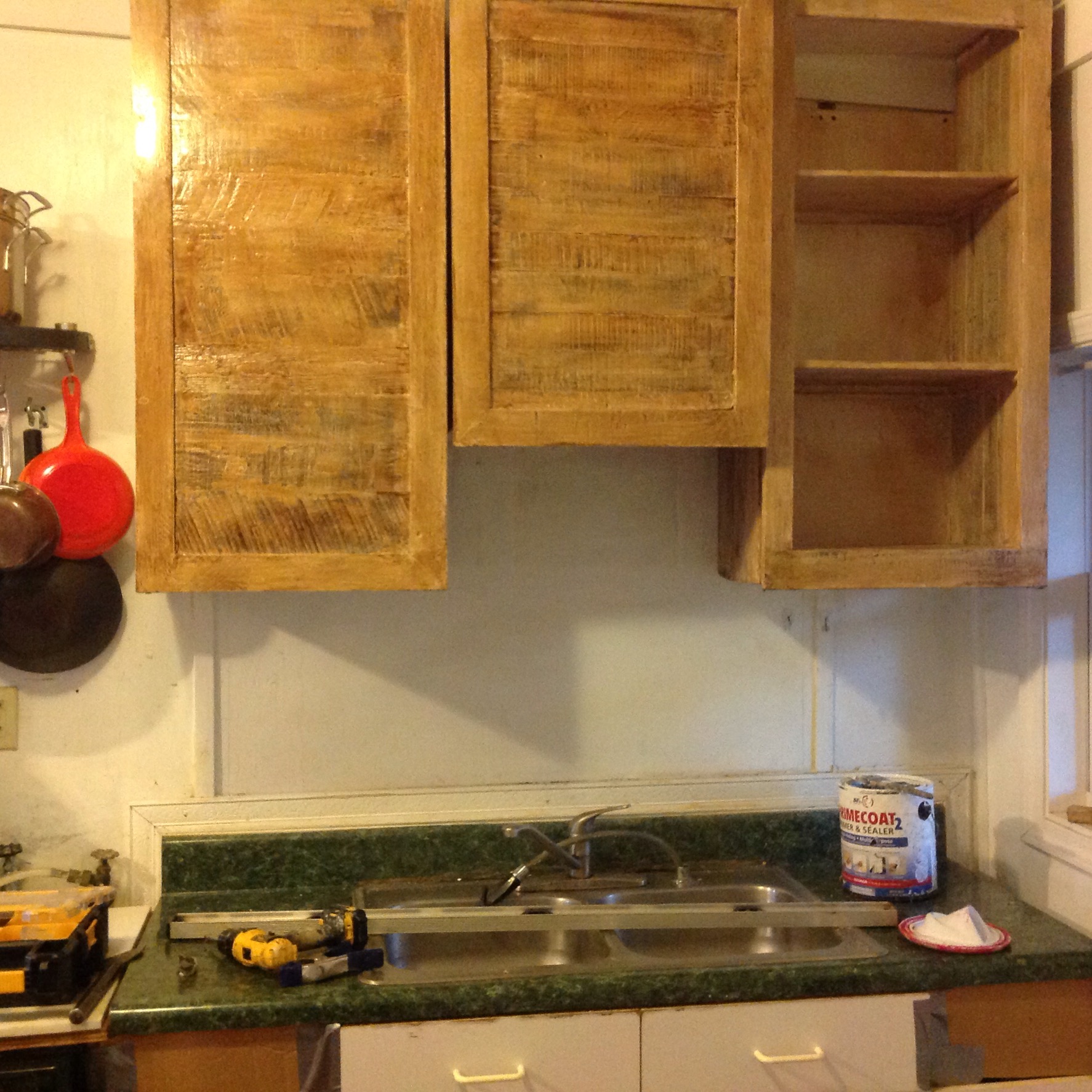
On the wall! Building the wall cabs first meant I could stand on the sink to install these and not worry about messing anything up. Making separate units meant that I could actually carry them and get them on the wall, adding the doors and hardware later.

Next up - the sink and counter top.The sink cab and counter top took about a week to make. Drawers are hard!!! It was pretty much the same steps for the cabinet. Putty, sand, white wash and stain, but the counter top was a little different. I cut down a 1/2 inch piece of plywood to size and cut the hole for the sink. Next, I glued and nailed down wood that was the same thickness to the plywood. For contrast, painted the top white with just a touch of the grain coming through. Then 5 coats of urethane gave it a smooth aged character.

I did the back splash just like the counter top, but without all the urethane coats. This made it a little lighter and you can see more of the grain. I don't EVEN want to get in to all the plumbing problems. That was the real headache of the job!!!

And here we go!! Except for the trim, phase 1 of the new kitchen. Leak free with new sink and faucet! Even put in a filtered water faucet. For phase 2, I'll build other cabinets to go around stove, but for now, I can't wait to get back in the studio to paint.
The weather is just about perfect right now, so come out to the Brookhaven Arts Festival this weekend and check out my new paintings. There will be a lot of great music, food and fun activities for kids as well.
Saturday, October 15, 2016
10 AM – 6 PM
Sunday, October 16, 2016
12 PM – 5 PM
Location: 4047 Peachtree RoadNE
Behind Brookhaven MARTA (Apple Valley Road side)
On October 15-16, 2016, Brookhaven will host the 2nd Annual Brookhaven Arts Festival through the Brookhaven Community Foundation. More than 100 participating artists will feature works of fiber, glass, jewelry, mixed media, painting, photography, sculpture and more. Musical performances will take place over two days with featured performers. It’s a great time for individuals and families to enjoy the beauty of fall while enjoying terrific food, music and art. Join us!

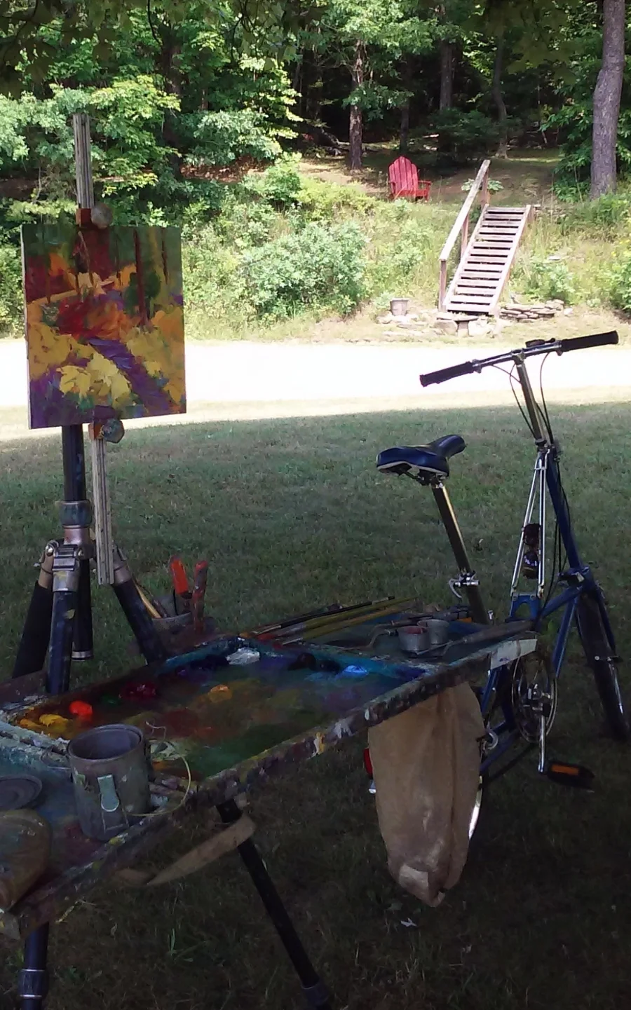
Well, I didn't stay home for long! My friends invited me to come to Tennessee for a couple of days to paint, and I couldn't pass up the offer. This was my studio this morning. Abrams Fall in Cades Cove in the Smokey Mountains. So worth the 2.5 mile hike to get there, but I'm not sure if I'll make it back out for a second painting!!
Alexandria was a fantastic show, but it's nice to be home. A great way to wrap up the eastern art tour. These are a few paintings that found new homes. A big thank you to my new art collectors!!

Stop by and visit me in booth # 117. I look forward to this quality show each year and I'm excited to be back. My booth is by Royal and King St. Hope to see you! - Dawn
About the Festival
When:
Saturday, September 17th, 2016 from 10:00am to 7:00pm
Sunday, September 18th, 2016 from 10:00am to 5:00pm
Where:
480 King St. in Alexandria, VA
Cost:
Free Admission

This course emphasizes artistic development in a relaxed and fun studio environment with a variety of music to keep you motivated. Regardless of your level of training or ability. Any Missed classes can be made up next session. You have one year to make up classes.

Hello everyone,
The month of August has blown by! It was my annual trip to the Northeast for art shows, catching up with friends, and outdoor adventures. I had art shows in Mystic, CT, Mount Gretna, PA, and Pittsburgh, and I'm happy to say the shows were a success! Pictured above are a few of my favorites that found new homes. A big thank you to my new and returning art collectors!
After a month on the road, it's great to get back in the studio and see what I can come up with next. I have 2 more shows this year: Alexandria, VA September 17 and 18, and Brookhaven, GA October 15 and 16.
Tuesday Evening Painting Studio
Tue, Sep 13 - Nov 15, 6:15pm - 9:15pm 9 Weeks $265, 5 weeks $175 No Class Nov 1
Painting Techniques for all levels
Wed, Sep 21- Oct 26, 10:00am - 1:00pm 6 Weeks $225
3 Day Plein Air Workshop Coastal North Carolina
Sun, Oct 30 - Tue, Nov 1, 10:00am - 4:00pm $250 / $225 for AOA members. Elizabeth City, NC
This is a great time to get outside and paint!
For more info, check out my Classes page.
Join me if you can. I'd love to paint with you!
Dawn
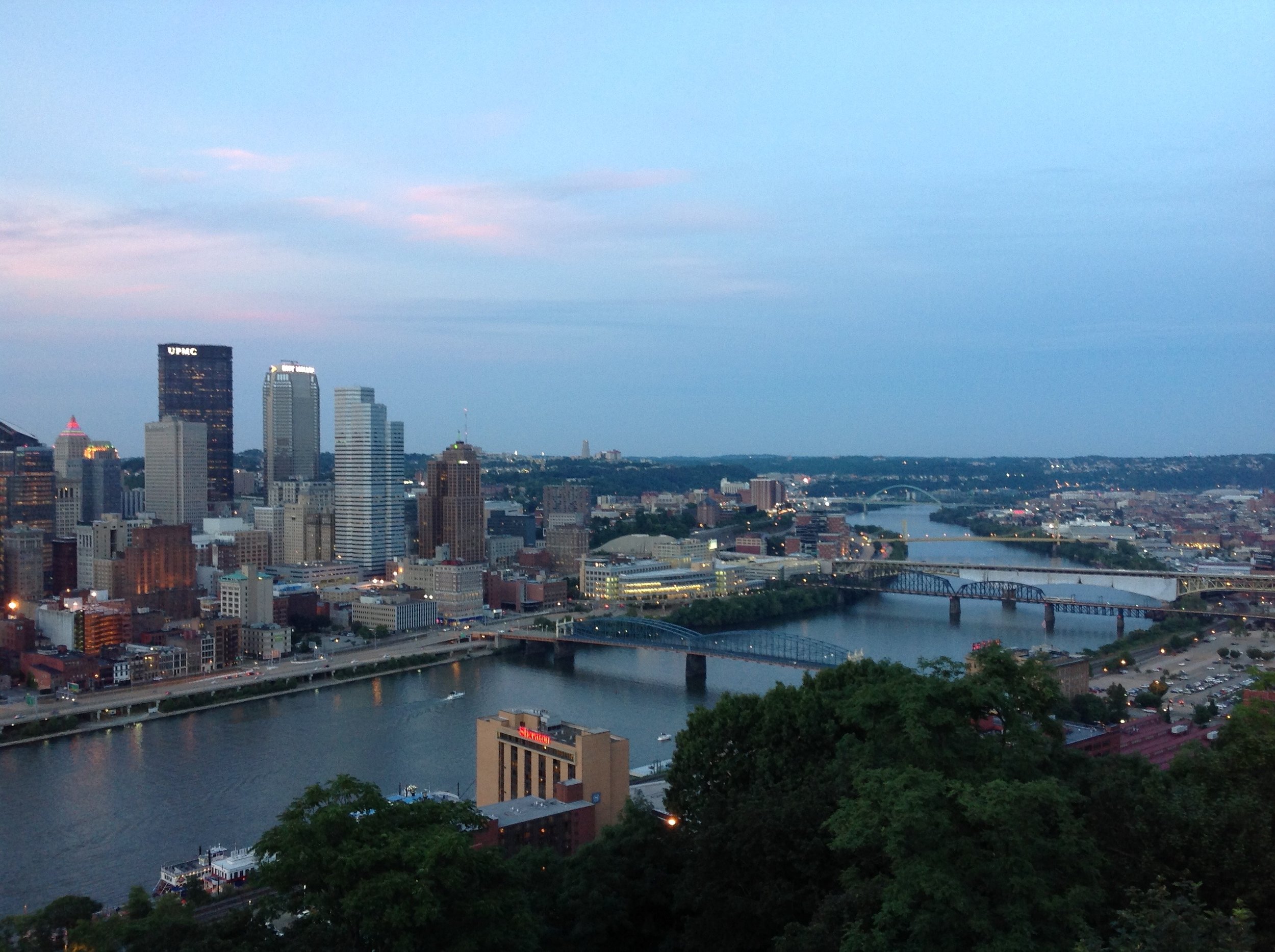
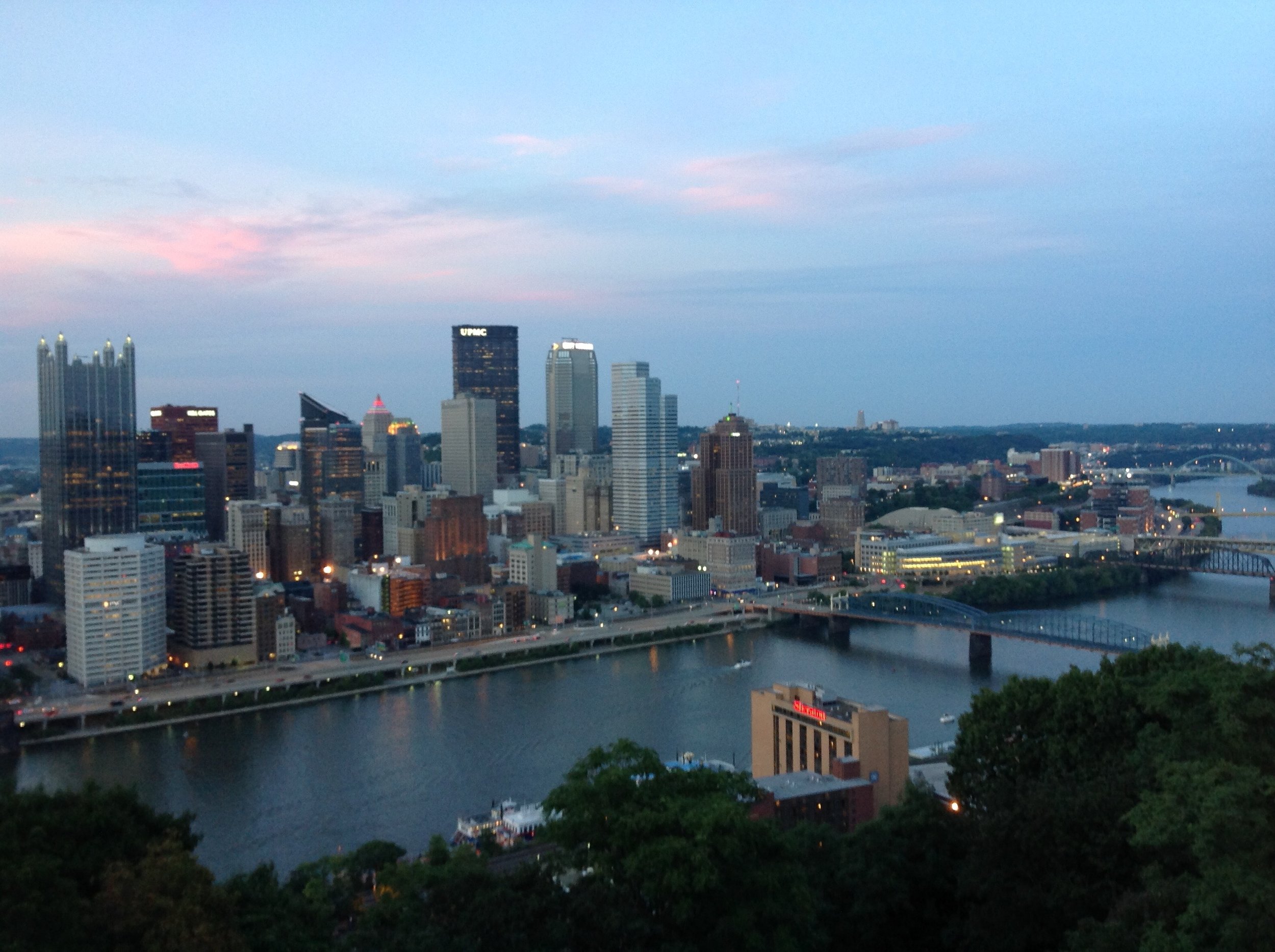
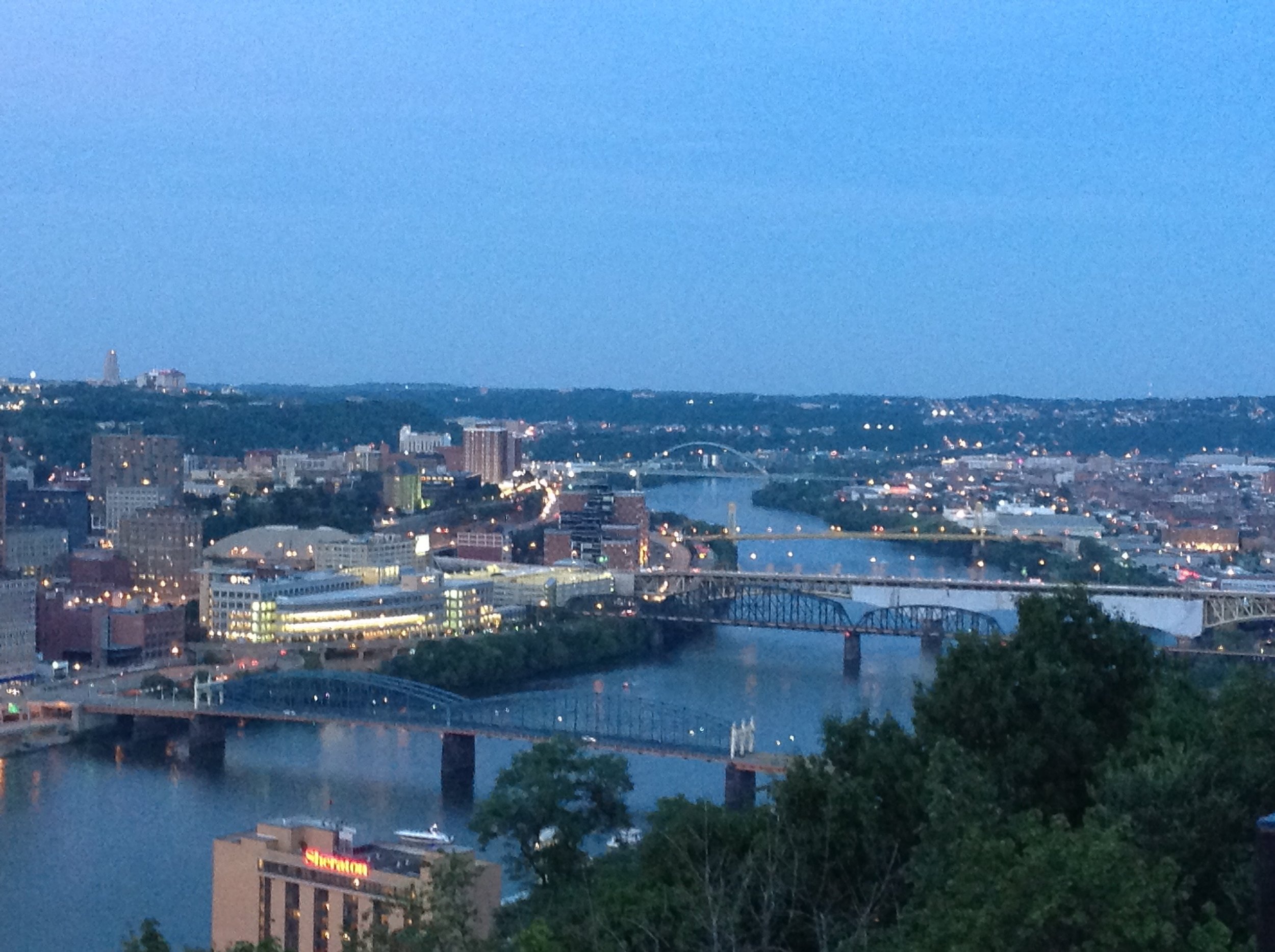
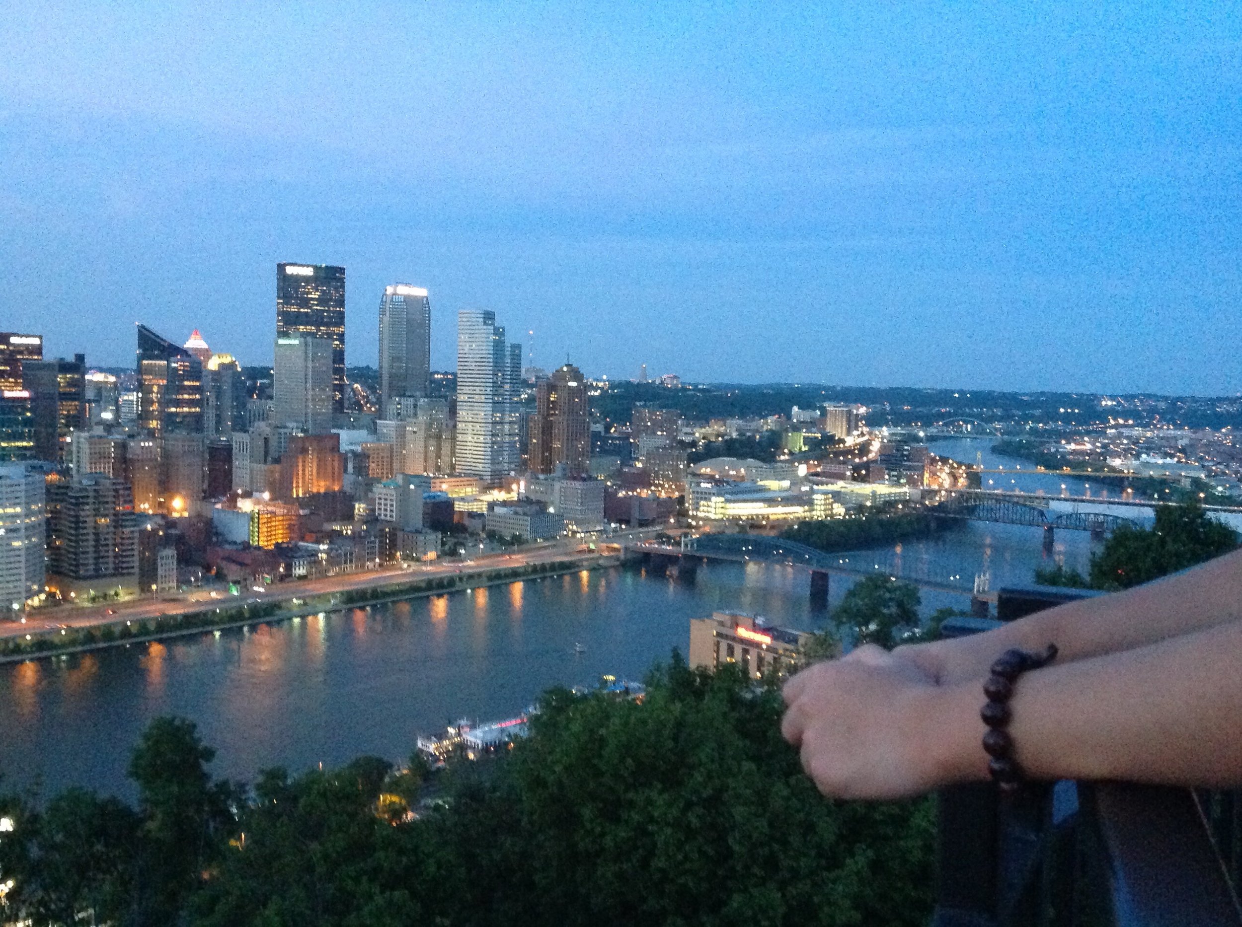
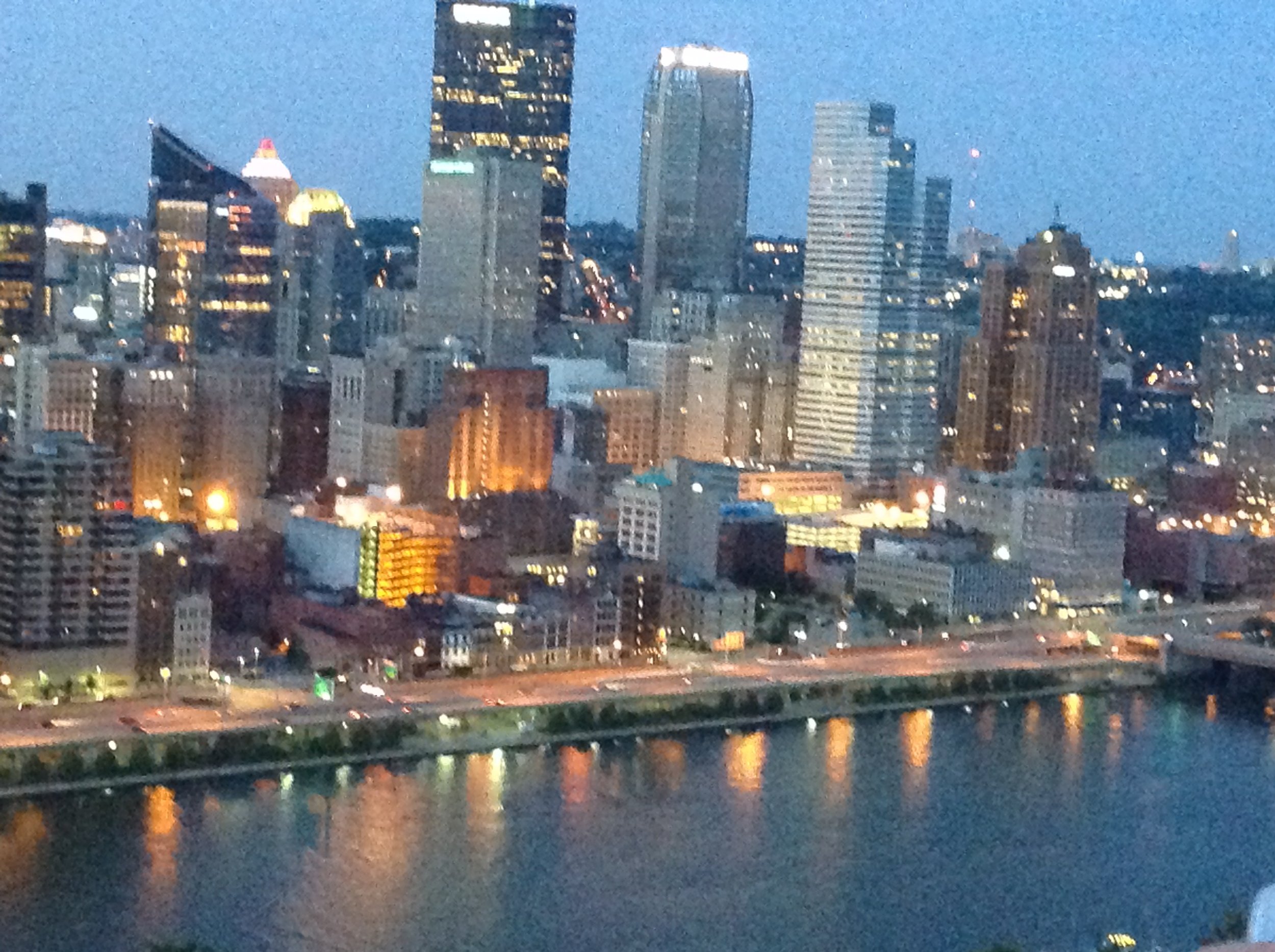
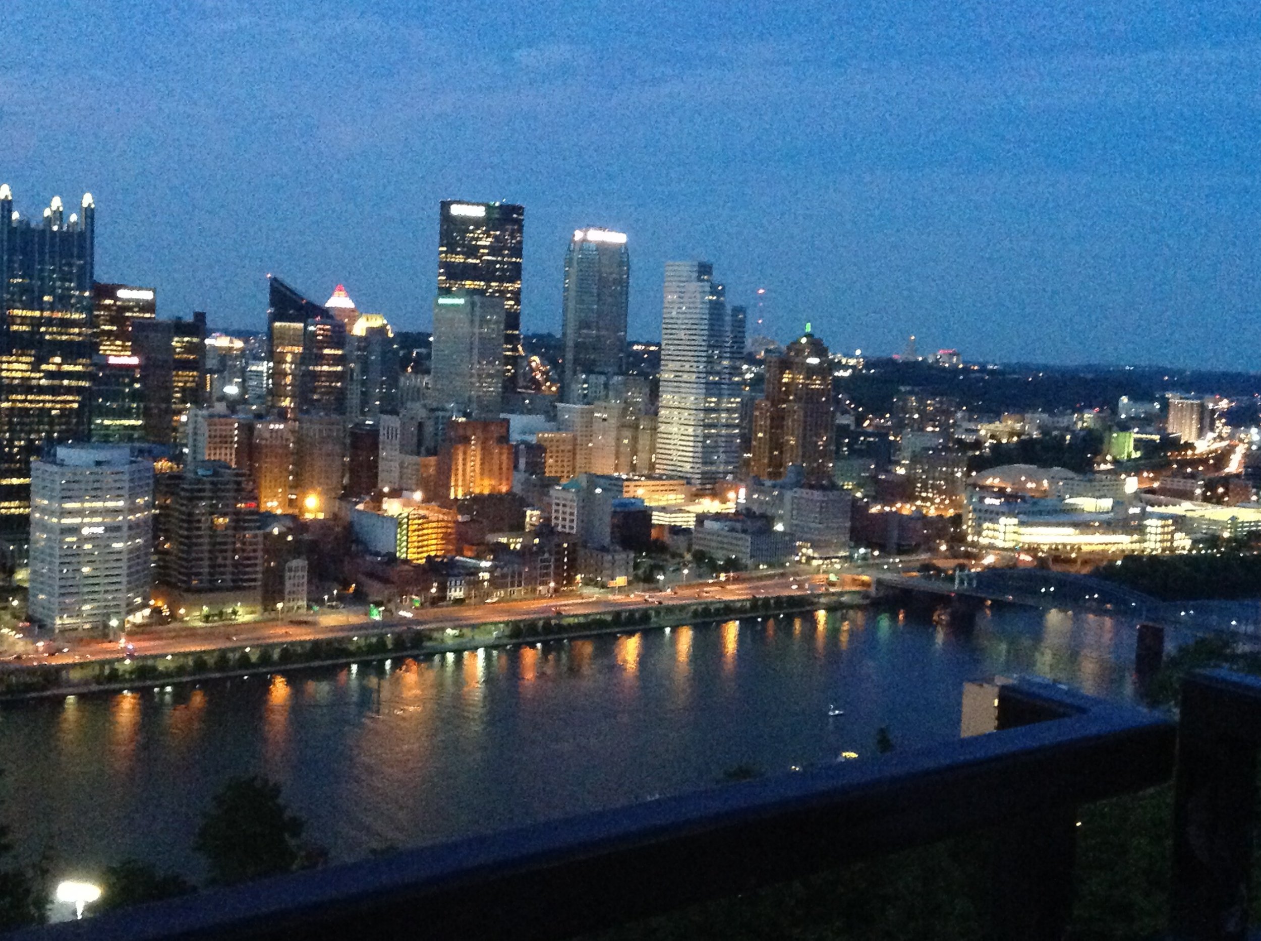
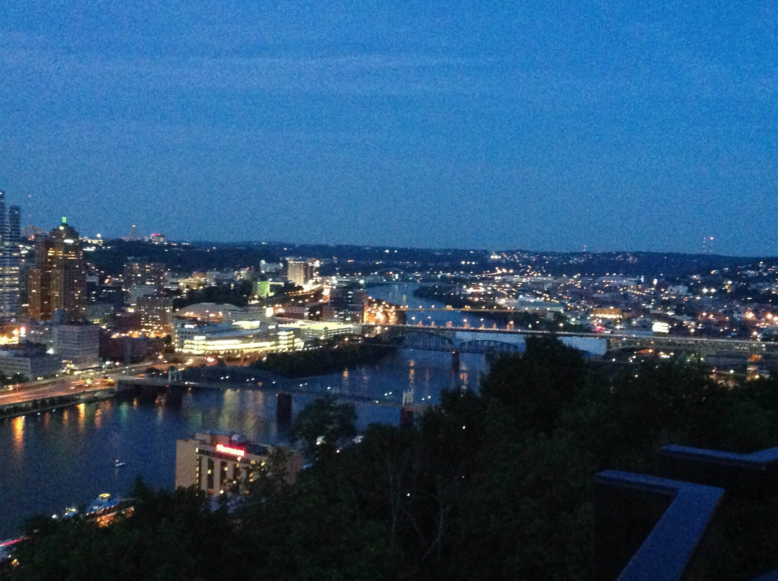
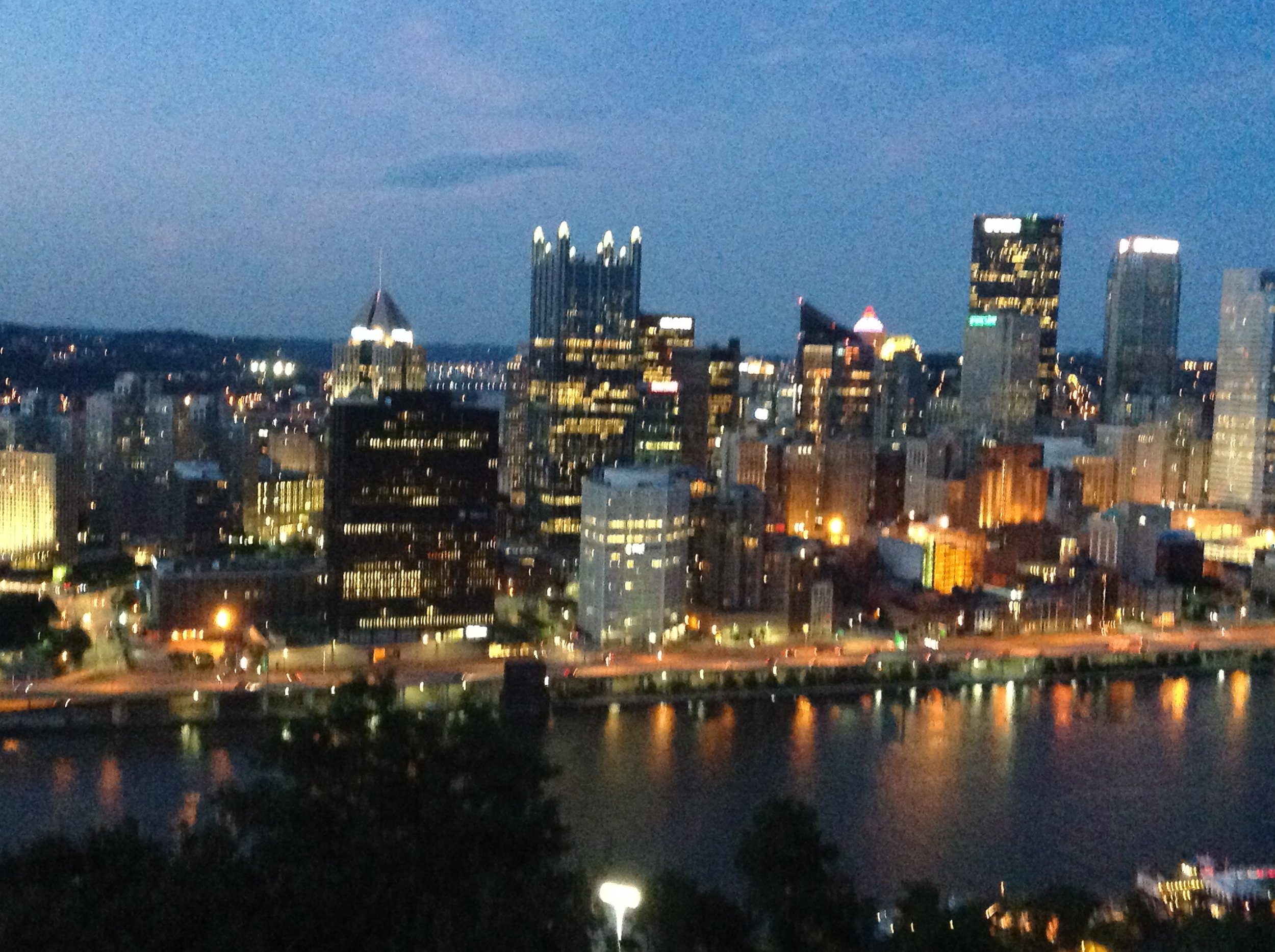
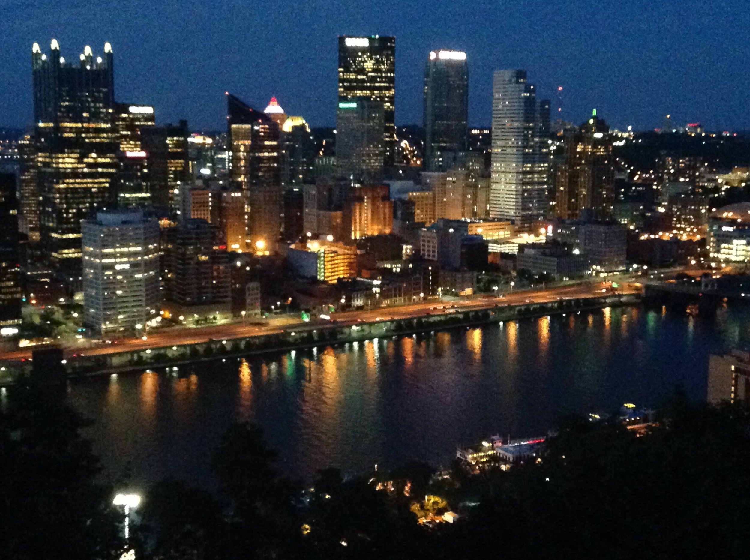
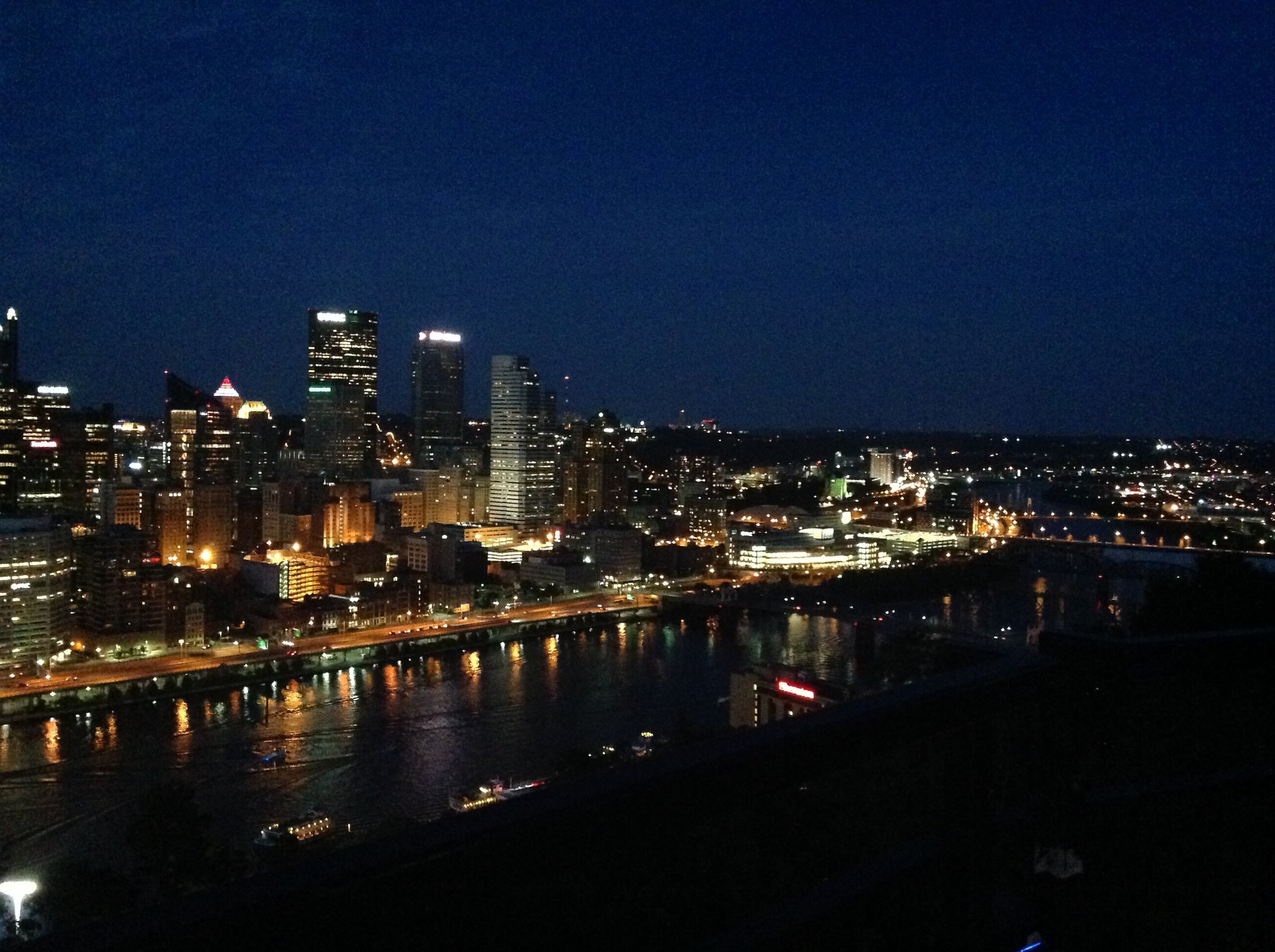
I took the incline to the top of Mount Washington to check out the view. I kept hearing about how it's a great view of Pittsburgh. A friend told to stay and watch for the night sky. It was impressive. I really enjoyed watching the eying sky slip away and the light of the city turn on. A beautiful city - it's official - I love this city - in the summer. Great biking, cool architecture, and the rivers. It has it all! It is too bad that I'll have to get back to work soon.
Have a great weekend,
Dawn
Shady Side Art Festival on Walnut Street - Booth #57 at Walnut and S. Aiken

When:
10:00am to 7:00pm
10:00am to 5:00pm
Where: - Find me in Booth #57 at Walnut and S. Aiken
739 Bellefonte St in Pittsburgh, PA
Cost: Free Admission
RSVP:
The 20th Annual Shadyside… The Art Festival on Walnut Street is a proven summer weekend art show located in the Shadyside area of Pittsburgh, PA. On August 27th and 28th this popular neighborhood of tree-lined streets, historic homes and trendy businesses will again be transformed into an outdoor gallery of fine art. The Shadyside locals look forward to this fine art show each year. Walnut Street offers something for everyone – national retail stores, unique locally owned shops, numerous restaurants, bars and eateries featuring a vast variety of cuisines. Hope to see you our there!!
Venue: Walnut Street in Shadyside (Pittsburgh, PA)

Class size limited to 5
Take control and paint with confidence In this intensive workshop you will learn to control your color and get the color you want.
In this class you will learn about pure color, get comfortable moving color from one hue to another, ways to get the most life out of your mixtures and how to keep your mixture clean and other store bought hues. There will be demos along with painting projects to reinforce the lessons. Such as using color to make your landscapes recede on the canvas or using color and value to create a sense of form in you paintings. Sat and Sunday will be demos and exercises, Monday you will bring in a photo to work from and put your new color knowledge to work. You can sign up for Sat & Sunday only if you can't make Monday.
Supply list
I prefer working in oils because my mixture will stay wet for the class. Acrylic willdry quicklyso you will need to keep them wet with water or a retarder.
July 16
Get Started Painting! For True Beginners
July 30
Palette Knife: Boats on the Water
Summer in the Mountain 10 x 10 oil on panel - plein air
A good friend had us out to paint in the North Ga Mountains last week and everything was just so green. After piddling around a little bit, I decided just to have a little fun with it and just go bold. Below is the actual scene I was working from. I think you can find the stairs but see if you can find the Adirondack chair in my painting....just kidding : ) - Dawn

White and Blue 11" x 14" oil on panel
I have been teaching still life classes the past few weeks and that has be back painting florals. This was from todays class. I was thinking a bout a red, white and blue theme, thinking about the 4th of July. So I used warm colors in the red family for the background and the wonderful hydrangeas from the yard.
Everyone did a great job, but it was a little more challenging than I anticipated for a beginning class. I'll have to simplify the next assignment.
Happy painting - Dawn

Stop by and see the wonderful art created by 19 local artists

This is a great exhibition of local artists who've taken classes with me and continue to grow and produce great art. Please join us for the opening reception on Sat, June 18th from 3 - 6:30
Hope to see you there,
Dawn

You just never know who will see you when you're out and about painting the town. What a fun surprise to find my painting on the front of the Living Section today. I really love the improvement around Colony Square. The brightly colored letter are super cool and I like watching how people interact with them. A fun day of painting!!
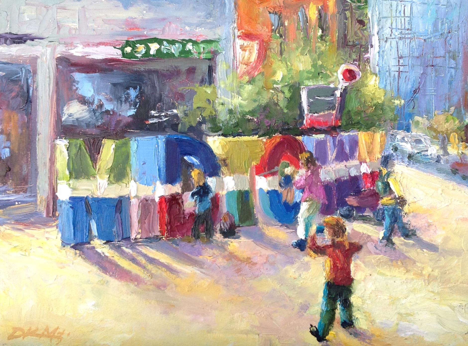
"Welcome to Midtown" 9 x12 oil on panel. Click here to go to my online store
I follow Michael Chesley Johnson's blog and saw this the other day. I thought he had some good ideas about mixing grays and wanted to share them. I hope you find this as interesting as I did.
You can check out his work at http://www.michaelchesleyjohnson.com

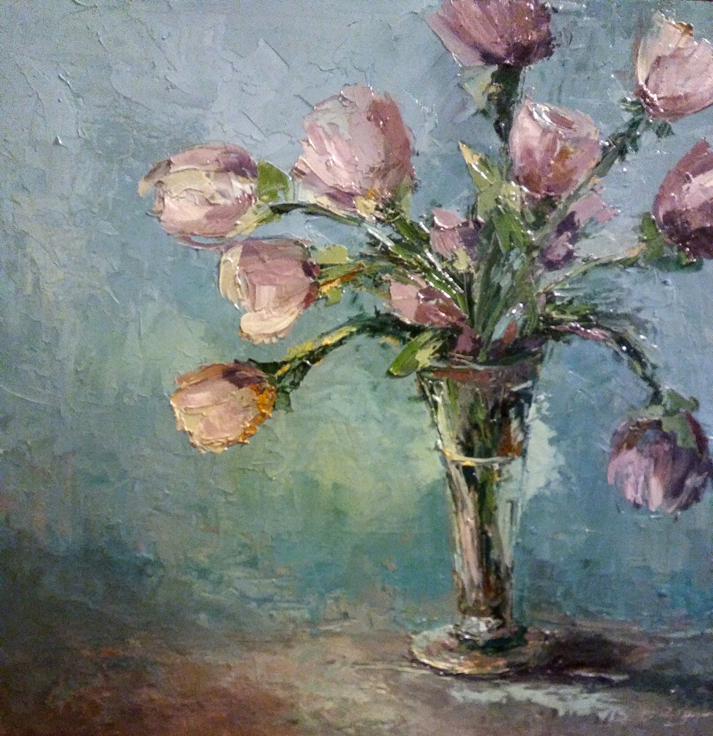
"Morning at Raccoon Beach" 5x7, oil
Greys are both easy and difficult to conjure up. Easy, because there's nothing like a dirty brush to work its black magic in creating rather ugly greys. Difficult, because a pretty grey takes a certain amount of apprenticeship in mixing color.
First, let's make sure we've got reasonably clean brushes. That will keep you from summoning grey without meaning to. Now, let's think about how greys are made.
They say you can make a grey by mixing a color with its complement. This is true, but it can be a very muddy grey. A prettier grey can be made by mixing a color with its near-complement instead. This is because the grey is closer in character to the color being greyed. Try it. Use a color wheel to help you identify the near-complement. If you want to grey down a green, don't use red - instead, use red-violet or red-orange.
Let's take this a step farther. Look at the color you want to grey and decide if it is a cool or warm version of its base color. To grey it, add the same temperature of its complement. If it's a cool red, use a cool green. If you use a warm green with a cool red, this will make mud. Using a cool with a cool will make a more beautiful grey. As an example, I paint a lot of fog, and many times I'll start off with a light pink - that's cadmium red light with lots of white, and very cool - and then scumble on a light cool green, such as viridian with lots of white. This combination gives me a mudless fog.
In the little 5x7 sketch above, I use this approach, but for a sunny scene. The scene had a lot of grey in it. I painted all the major shapes with the complement of the correct value and correct color temperature, and then overlaid them with the local color.
(First posted June 15, 2011)
--- Michael Chesley Johnson, AIS PSA MPAC PSNM www.MichaelChesleyJohnson.com
Paint on my friends,
Dawn